
Much of the data that we rely on for creating indicators to be included in equity atlases (particularly U.S. Census and American Community Survey data) involve categorizing the attributes of various population groups and mapping them using vectors. This means the data are displayed in pre-set geographic units such as census block groups, census tracts, zip codes, cities or counties. Vector data are mapped using a value that is an aggregation or average of all of the values within a specific geographic unit. The most common reasons for reporting summary values for population data are to ensure individual confidentiality (for the decennial census data) or to maintain data reliability (commensurate with statistical sampling strategies such as those used by the American Community Survey).
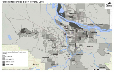
Vector data are often displayed using a choropleth map – a thematic map that uses a single color palette to display the range of data values (a light tint signifies low values, while a dark tint shows high values). For example, the map of poverty in the Regional Equity Atlas 2.0 shows the average poverty rate calculated for each census tract. For more information on choropleth maps, see Applying Cartographic Principles.
Challenges of Vector Maps
Vector maps provide a useful and easy to understand way of presenting essential data, but there are also challenges in developing and interpreting vector maps that should be kept in mind.
Value Distribution: Average or aggregate values are statistically valid measures that provide valuable data about the overall spatial distribution of various phenomena. However, you cannot automatically assume that the value represented within a particular polygon is distributed evenly throughout the polygon’s geographic area. For example, even if there is a high percentage of people in poverty relative to the total population in a given census tract, those people may be concentrated in one part of the census tract rather than evenly distributed across the entire census tract. Conversely, a census tract with a low percentage of poverty overall may still have sub-areas with high numbers of people in poverty. Polygon vector maps are useful for identifying general areas of interest, but groundtruthing (collecting additional data from sample sites on the ground) is often necessary to gather further information about where specific populations are located.
Geographic Resolution: Since census tract boundaries are largely determined by population (with each census tract having approximately 4,000 people), the geographic size of the census tracts can vary widely across a region. Less populated rural areas have very large census tracts, while denser urban areas have smaller census tracts. It is important to remember that the entire census tract will display the color associated with the average value for that tract, giving a strong visual impression that the population, as well, is evenly distributed throughout the entire tract area. While this may be true in dense urban census tracts, the population in large rural census tracts is likely to be concentrated in the few small towns that may be located within the tract. In addition, the sheer size of rural census tracts can also create visual distortions. The smaller urban tracts may display a wider variety of colors or tints within the map, but this pattern can be overshadowed by the larger rural tract, particularly if that tract displays a darker color than most of the small urban tracts. When a map covers a large region (such as the Household Poverty map example above), it is often necessary to create inset maps that zoom into more dense areas so that the more diverse spatial patterns in these areas are more easily observed (see Applying Cartographic Principles for more information).
Normalization of Data: The most common mistake in constructing vector (or choropleth) maps is to use total values (also referred to as “raw” data) rather than data that have been normalized. Normalization refers to the process of standardizing values measured on different scales to a common scale. Normalization is particularly important when mapping spatial data. As discussed above, the area of geographic units such as census tracts can vary widely across a region. Normalization of the data creates a common measure for the “area” variable and is typically achieved by calculating a percent of total (e.g. percent of households in poverty) or density (e.g. population per acre). While there may be some situations in which mapping raw data about populations is appropriate, it is important to note that a map of “totals” can look significantly different than a map that uses the same data, but normalizes the values as “percent of total.”
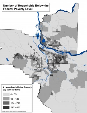
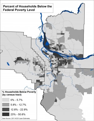
For example, the two maps to the left use the same data about household poverty using the same color palette and classification scheme (“natural breaks” which calculates statistically significant breaks in the range of values based on the number of classes). The first maps the total figures, while the second displays percent of total. While the differences may be subtle, in interpreting these maps remember that they address different kinds of questions. The map of total numbers of households in poverty locates areas that have the highest numbers, without considering these numbers in relationship to the surrounding area. The map that displays percent of households in poverty locates areas where poverty is concentrated.
Choropleth maps based on 2011 American Community Survey data on household poverty mapped by census tracts.
The first map uses the raw totals (total number of households in poverty). The second map displays percent of total.
Strategies for Addressing the Challenges
Dasymetric Mapping: Dasymetric mapping involves gathering and incorporating additional information about the landscape to determine where people live in order to more accurately map population-based data. Additional information can include locating parks and natural areas, using an elevation model to eliminate mountainous areas, and isolating residential tax lots. When additional data are not easily obtainable, other methods can be used. These include using aerial images to locate and digitize occupied areas or applying more sophisticated digital models that predict the likely areas for population dispersal based on a set of characteristics. The ultimate goal is to eliminate non-residential areas and distribute the population vector data in a way that more closely reflects reality on the ground.
Click here for an example of the use of dasymetric mapping.
Creating an Ecumene Mask: Population data based on the decennial census can be obtained at a high level of geographic resolution (a census block, which is designed to encompass 300-500 people). Vector data that are at a high geographic resolution can be converted into a raster format. A raster format displays data as a grid of cells (or pixels). The cell size can be very small creating a smoother, more precise and spatially nuanced map.
| Ecumene: Derives from the Greco- Roman word for “inhabitant” and refers to the permanently inhabited portion of the earth as distinguished from the uninhabited or temporarily inhabited areas. |
Because converting to a raster format is designed to enhance precision, care must be exercised to distribute the population vector data accurately, particularly in the larger rural census block geographies. Not doing so will exacerbate the visual distortions and interpretation problems described above. An "ecumene" mask is a specific approach in dasymetric mapping that addresses this problem by masking out areas that are likely to have no residential population (e.g. industrial parks, natural areas, etc.). When converting the block-level data into a raster format, the values are only distributed in those areas not masked in order to create a more accurate map. An ecumene mask can also be used as an overlay data layer to help in interpreting choropleth maps that use rather large geographic units.
For an overview of the methodology used for applying an ecumene mask to the Regional Equity Atlas 2.0 demographic heatmaps, click here (PDF).
Areal and Value Interpolation: When the geography for which vector data are available does not match the geography of analysis, interpolation can be used to reconfigure the data into the desired geography. Interpolation is used to create maps that are easier to interpret and utilize for making decisions. For example, census tract boundaries usually do not neatly match neighborhood boundaries. Areal interpolation can be used to reassign data from census geographic units to neighborhood boundaries to create maps that are more meaningful for local residents and policy-makers.
Interpolation is also used to make adjustments in constructing change-over-time maps. For example, the boundaries of census tracts are assessed for each decennial census and adjusted to maintain desired population levels (a census tract may be split into two tracts or two tracts may be combined). In this case, value interpolation is used to reassign the data (which uses the total value rather that the area to determine how to reconfigure the data). In both areal and value interpolation, a factor (or multiplier) is calculated that reflects a proportion of the area or the total value. This factor determines how much of the data will be assigned to the new geographic unit.
Click here for more information on how to use GIS software for areal interpolation.