
General Guidelines in Creating Maps
The purpose of a map is to convey information to a map reader that is accurate and understandable. A good rule of thumb when constructing a map is to KEEP IT SIMPLE. The more information that is placed on a map, the more difficult it will be to interpret.
- Data that convey the main message should be the most prominent feature on the map. Everything else should visually “fall into the background.” Avoid including multiple data layers on the same map unless the map’s primary purpose is to illustrate the connections between those layers.
- Be sparing in your use of reference layers. Including reference layers, such as jurisdictional boundaries, roads, rivers and map labels, in your map can be helpful for both spatial orientation and map interpretation. But use these layers sparingly and in a way that does not overly distract from the primary data you wish to show. The map can easily become cluttered and difficult to read with this supplementary information.
- Consider creating a map series to make your data more understandable. If the message you want to convey is complicated and involves making connections between many different data layers, consider creating a series of maps that show different data layers rather than a single map with too much data.
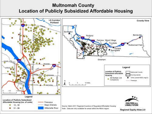 Use map insets to focus attention on smaller geographies: Maps that show information at a county or regional scale can obscure important detail at a neighborhood scale. Inset maps can be used to zoom in to areas of interest. The map on the right illustrates the use of an inset to highlight an area on the larger map that was unreadable at a county scale because of the density of the points in that part of the map.
Data Formats
Raster: The raster format uses a grid to display spatial data and records a single attribute value for each cell in the grid (e.g. depth of the lake at each cell). Rasters are useful for displaying data at a high spatial resolution with characteristics that spread out across a landscape (referred to as a continuous surface). Physical features, such as soils or elevation, are often displayed as a raster. Census data collected as the block-level, a small geographic unit consisting of about 300-500 people, can also be converted to a raster in order to create a more even-looking distribution of the data.
Vector: The vector format displays data either as points, lines or polygons. Each feature in this space is discrete (clearly defined boundaries) and homogenous (the value is assumed to be spread evenly within a feature). The vector format makes it possible to display multiple attributes associated with a geographic area, but it does not capture the variations in those attributes within the geographic area. For example, a vector map could show the average depth and temperature of a lake, but it would not capture variations in the depth and temperature in different parts of the lake.
Whether raster or vector data are used to create a map depends in large part on how the data are collected and disseminated as well as the most appropriate way in which to display the data. The following general rules apply:
1. Use the vector data format when several thematic or topographic data layers are needed on a single map.
2. Do not convert vector data aggregated at a spatial resolution larger than a census block group to a raster. Because of the homogenous nature of vector data, this will produce a map that implies the data is distributed evenly over the surface
when, in fact, it may not be.
3. Keep in mind that only one raster data layer can be displayed at a time (this is also true for a vector layer that is filled with a color, such as in a choropleth map). However, point and line vector features can be placed over a raster or layered with
other vectors.
4. The size of the raster cell determines how smooth the raster image will seem (this is a function of how the data are collected). The size of the cell should be appropriate for the scale that will be used to create the map in order to limit “pixilation” (jagged edges). 
Classification Schemes
Classification is a method of categorizing quantitative data (aggregating the full range of data values into a set of classes) that is used to reduce complexity and show general spatial patterns. Classification applies to both raster and vector data. The most important choices to make are which classification method to use and the number of classes to create.
Types of Classification Schemes:
- Classification schemes based on exogenous criteria are schemes that use important data values as classification break points (e.g. a data set of population height and weight ratios divided into classes based on commonly accepted thresholds for classifying people as underweight, normal weight, overweight, and obese).
- Other methods consider the quantitative properties of data. Some common examples include equal interval, quantile, and natural breaks.
- The equal interval classification method divides the range of the data into classes with equal-sized ranges (e.g. a data set with values from 0 to 80 divided into 4 classes would have the classes 0-20, 20-40, 40-60, and 60-80).
- The quantile method divides the data set into equal numbers of observations per class (e.g. in a data set with 20 observations and 4 classes, each class would have 5 observations).
- Natural breaks are determined by looking at a histogram of the data values and placing breaks in places where the slope significantly changes. The natural breaks method is the most common (most GIS programs have wizards that will calculate the natural breaks).
- The equal interval classification method divides the range of the data into classes with equal-sized ranges (e.g. a data set with values from 0 to 80 divided into 4 classes would have the classes 0-20, 20-40, 40-60, and 60-80).
All classified data should be examined to determine whether or not altering the classification method has a significant impact on the display. Choose a classification scheme that best reflects the distribution of the data.
Use the following link for a comprehensive slideshow that discusses the pros and cons of various classification schemes:
http://www.slideshare.net/johnjreiser/classification-systems
No matter what classification scheme is used, the following rules should ALWAYS apply:
1. Each of the original data values must fall into one of the classes (exhaustive).
2. None of the original data values should be able to fall into more than one class (mutually exclusive).
The Rule of Seven: When deciding how many classes to use, it is important to evaluate whether your map readers will be able to physically see differences in the symbol set you will use. For example, if you are creating a choropleth map and are only using one color hue as a visual variable, most map readers will only be able to distinguish seven different value levels (the lightness- darkness of the color), so your map should not exceed seven classes. In general, people are more able to distinguish variations in red, green and purple better than yellow, orange or blue. The Rule of Seven also applies to the use of gradated (variations in size) point symbols. More classes can be incorporated if using several color hues (as discussed below).
Symbology
Color Schemes: The main thing to remember when designing a color scheme is that you want the logic of your colors to relate to the logic in your data. There are three main types of color schemes: sequential, diverging and qualitative.
- A sequential scheme is typically used to represent differences in the amount of the phenomenon you are mapping. This difference may be quantitative (e.g. numbers of people) or ordinal (e.g. least polluted to most polluted). Typically, a single color is used with variation in intensity (where dark is associated with “more” and light is associated with “less”). When using a single color the Rule of Seven should be employed. However, it is possible to extend the sequence by using more than one hue (e.g. from yellow to green to blue). In this case, take care in moving through a logical color sequence (think about the colors of the rainbow) to maintain the sequential nature of the visualization. Choropleth thematic maps employ a sequential scheme.
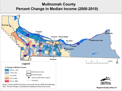 A diverging scheme is typically used to show gains and losses by using two color sequences with a neutral color (typically a light color such as beige) as the midpoint. For example, change-over-time maps typically use a diverging scheme with one sequence of color variations showing gains, another showing losses, and a neutral color indicating no change. Diverging color schemes are better able to help map readers identify true clusters of high or low values on maps because of the added differentiation that a second hue brings to the map. Contrasting colors (e.g. blue – beige – red) are used to emphasize this divergence, as illustrated in the map on the right.
- A qualitative scheme uses differences in color hue to indicate differences in the characteristic of some phenomenon. For example, different colored points could be used to indicate elementary, junior and high schools. In a qualitative scheme, you will generally want to choose different color hues with approximately the same intensity or value level so as not to imply a quantitative difference as well. In general, do not mix heavily saturated colors with pastels.
Colors have Meaning: Selecting appropriate colors to represent spatial phenomena is a critical decision when designing maps. Colors have meaning! For example, shades of red are often thought of as hot-warm colors and indicate expansion, whereas shades of blue are cold-cool colors and indicate contraction. Green is the color of money or it could mean a verdant landscape. A bright red color often evokes feelings of power, anger or danger (think of a stop sign or the saying, “seeing red”).
- Be culturally and politically sensitive when selecting color schemes: Suffice it to say, when displaying population data on a map, DO NOT use a brown or black color scheme for populations of color. Choose neutral colors such as purple, green or shades of blue. When mapping election results, make sure to employ the conventional “red” and “blue” appropriately to represent the two political parties.
- Color Blindness: In the most common type of color vision impairment, individuals have difficulty distinguishing between reddish and greenish hues. Color schemes can be designed that will be readable for those with color vision impairment by carefully using light differences and color charts to anticipate hue pairs that may be difficult for color impaired map readers to see. For further information see: Olson, J. and C. Brewer. (1997). “An evaluation of color selections to accommodate map users with color vision impairments.” Annals of the Association of American Geographers 87(1): 103-134. The following link also provides a resource for selecting color combinations for those with color impairments (http://colororacle.org/design.html).
Color Brewer (http://colorbrewer2.org/) is a free map design tool developed by Cynthia Brewer at Pennsylvania State University that offers assistance in selecting colors for a map. The tool allows users to test out different color schemes taking into account the number of classes, the nature of the data, the preferred hues, as well as issues like color blindness and print friendliness.
Point Symbols: Single or graduated point symbols can be used creatively to illustrate point features on a map. Point symbols can range from abstract, geometric symbols (e.g. bars, circles, or squares) to pictographic symbols (e.g. campgrounds, schools, courthouses). For features that have a shared meaning (e.g. campgrounds), pictographic symbols are most effective. Geometric symbols can be used to display qualitative data (e.g. each symbol is assigned a different color or shape to represent different features) as well as quantitative data. For quantitative features, if you want the map reader to also be able to estimate the value of the feature, use graduated geometric symbols where the size of the symbol reflects the chosen classification scheme. In all cases, choose a set of symbols that are clearly differentiable from each other (i.e. choose symbol sizes that will not be confused with each other). Avoid using point symbols that obscure other features in the map.
For information on accepted conventions for map symbolization, see the Federal Geographic Data Committee cartographic standards page at http://ngmdb.usgs.gov/fgdc_gds/geolsymstd.php.
Enumeration Units and Normalization of Data
One important issue to consider in creating a map is that the size of enumeration units (the geographic units in which data are aggregated) can be quite variable. This issue is important because larger units will dominate the visual appearance of the map and can exaggerate the importance of particular geographic areas. Normalization refers to the process of standardizing values measured on different scales to a common scale, allowing for more realistic comparisons between unevenly sized geographic units. This is particularly important in displaying vector data, such as in a choropleth map.
Normalization typically involves converting raw counts to densities, percents or ratios. By transforming counts -- which are measures of magnitude -- to measures of intensity, normalization factors out the size of the areas being mapped. For example, a map of the total number of senior citizens in each census tract in a region would give the visual impression that the highest concentrations of seniors are located in the largest census tracts. Normalizing the data by mapping the percentage of senior citizens (i.e. the total number of senior citizens divided by the total population) in each census tract would provide a more accurate visual representation of the geographic distribution of the senior citizen population.
For more information on normalization of data, see http://www.esri.com/news/arcuser/0206/files/normalize2.pdf
Other Map Elements
Legends: Legends are required when any symbology has been used in the map. The legend tells the map reader how to interpret the map by identifying the classification system being used and what the colors and symbols mean. Most GIS software has wizards that allow you to easily construct a legend.
Title: The title of the map should make clear what the map is displaying.
Scale Bar and North Arrow: These are elements that most GIS software will be able to generate for you; they help map readers orient themselves spatially.
Other Text: Other explanatory text can be added to the map that provides useful information. This additional text is most often inserted at the bottom of the legend.
- Data resolution (the geographic unit of display – e.g. a census tract – if not included in the title)
- Date of the map
- Data sources (should at least include the source for the primary data layer)
- Contact information (who made the map -- in case the map reader has questions)