Maps have a unique power to graphically reveal the patterns and relationships that underlie the state of equity in our region. We know from experience that opportunities are not evenly distributed across our region, but these distributions are difficult to see from the ground. The Atlas maps are made up of data, but rather than displaying the data in tables, charts, or graphs, we show them as maps to bring patterns and relationships into focus. Maps allow us to see where things are and where they aren’t; to see areas in relationship to one another; to see the densities of particular demographic groups and the distributions of resources and opportunities; and to layer various indicators to determine how different factors relate to one another.
Types of Atlas Maps
How to Read Shape Maps
How to Read Heatmaps
Using Maps to Analyze Equity
Types of Atlas Maps
The Atlas 2.0 mapping tool includes two basic types of maps: Shapes and Heatmaps.
Shapes are used for indicators that are made up of vector layers, which means the data are displayed in pre-set geographic units rather than raster cells (or pixels). Shape indicators are displayed as points representing specific addresses or as polygons, which are shapes reflecting specific geographic units (e.g. census block groups, census tracts, zip codes, etc.) Shape indicator data cannot be ranked and combined into composite scores the way the Heatmaps can.
Heatmaps are used for indicators whose source data are at the highest spatial resolution available. Heatmaps display data as raster cells (or pixels) and offer the greatest degree of analytical power in the mapping tool. The Heatmap layers are scaled to a unit of 264 feet, which is approximately a square city block. Each unit of the Heatmap is assigned a value for each indicator; the values range from 1 to 5, with 5 representing the highest level of access and 1 representing the lowest level of access.
The data for the Heatmaps are displayed either as proximity or density measures. For indicators that measure proximity to a particular resource (e.g. grocery stores, parks, retail services, etc.), the mapping tool assigns a score to roughly every square block on the map based on how far that block is from the resource. The proximity scores are generated based on the following classification scheme:
|
Score |
Proximity |
|---|---|
|
5 |
0 to ¼ mile |
|
4 |
¼ to ½ mile |
|
3 |
½ to ¾ mile |
|
2 |
¾ to 1 mile |
|
1 |
1 mile and over |
For indicators that measure the density of a particular population or resource (e.g. people of color, home owners, sidewalks, etc.), the mapping tool generates a 1 to 5 score to reflect the density of the indicator within a specific geographic area (e.g. per acre, square mile, etc.) The density scores are generated based on the following classification scheme:
| Score | Density |
|---|---|
| 5 | High |
| 4 | High-Medium |
| 3 | Medium |
| 2 | Medium-Low |
| 1 | Low |
The specific densities that correspond to each score vary by indicator. The classification schemes for each density indicator are listed in the Mapping Tool User Guide and in the Metadata. Because the density scores do not use a uniform classification scheme, they can be used to compare the densities of a specific indicator across different geographic areas, but cannot be used to compare the densities of different indicators to one another.
The Heatmap cells can be combined into neighborhoods, census tracts, cities, or counties, and their values averaged across these geographies. This enables users to compare neighborhood averages to regional averages for each of the indicators and to compare neighborhood averages across different parts of the region.
Multiple Heatmap indicators can be combined to create a composite map. In the composite map, the value for each indicator is averaged to create a composite score that reflects the combined values of all of the indicators. The composite score is a relative score (or proportional ranking), not an absolute measure. The tool gives a score of 100 to the analysis unit (census tract, neighborhood, city, or county) with the highest composite value in the region and a score of 0 to the analysis unit with the lowest value in the region. The remaining analysis units are assigned a score between 0 and 100 based on a proportional ranking of where they fit between 0 and 100.
How to Read Shape Maps
The map below is a Shape map that shows the locations of publicly subsidized affordable housing units (the larger the red dot, the larger the number of units at each location) in relationship to census tracts with above the regional average percent of populations in poverty.
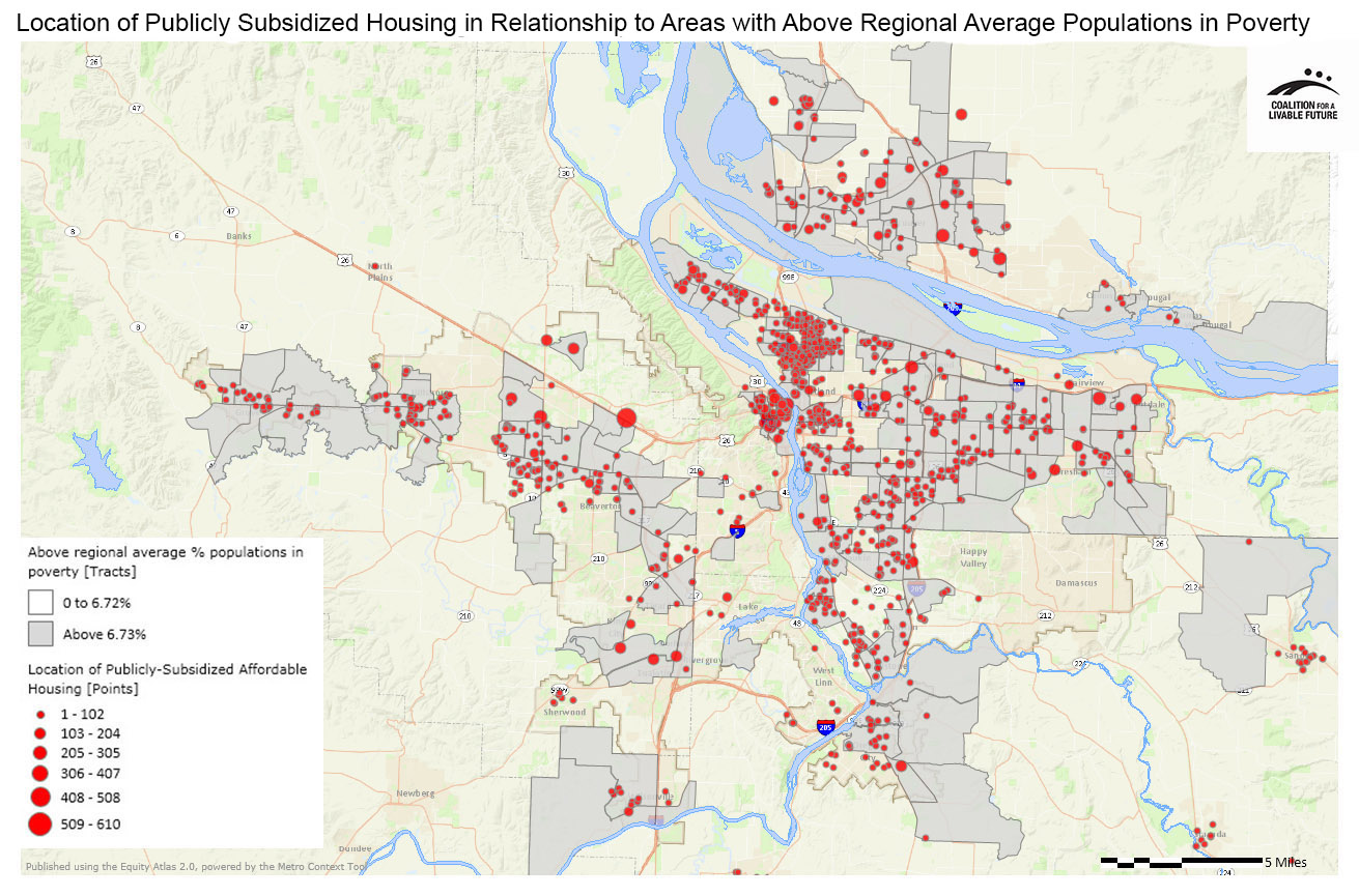
What This Map Can Tell Us
First, this map tells us where publicly subsidized affordable housing units are located in the region. If you were to zoom in to the map in the Equity Atlas online mapping tool, you would be able to see their actual street locations.
Second, you can see that these housing units aren’t distributed evenly across the region. Instead, they tend to be clustered in specific areas.
Third, the map indicates areas where people in poverty tend to live. We can also see that, like the locations of publicly subsidized affordable housing, people in poverty are not evenly distributed across the region.
By layering the two sets of indicators, we are able to see how the locations of affordable housing units relate to the geographic distribution of high poverty neighborhoods.
What This Map Can’t Tell Us
When reading maps, we must keep in mind that they are only an abstraction of reality and that the level of precision we see is determined both by the scale of the map and the geographic resolution of the available data.
While we can see the locations of these affordable housing units, the map tells us nothing about the condition of the housing, the sizes of the actual units, whether or not they are suitable for seniors or people with disabilities, their availability, or the experiences of the people living there.
Additionally, because the map doesn’t show the actual locations of people in poverty but, instead, shows us the average poverty rate by census tract (a geographic unit that includes approximately 4,000 people), we don’t know precisely how the people in poverty are distributed in relationship to the housing units. Even if there are high percentages of people in poverty in a given census tract, those people may be concentrated in one part of the census tract rather than evenly distributed across the census tract. So even though the poverty rate in a census tract may be high, the people in poverty in that census tract may not necessarily live in close proximity to the affordable housing units that are located in that census tract.
How to Read Heatmaps
The map below shows the densities of children under the age of five. It measures densities on a 1 to 5 scale, with 1 representing the areas with the lowest densities of children under age five per acre and 5 representing the areas with the highest densities of children under age five per acre. The areas with the lowest densities are shown in aqua, and the areas with the highest densities are shown in brown.
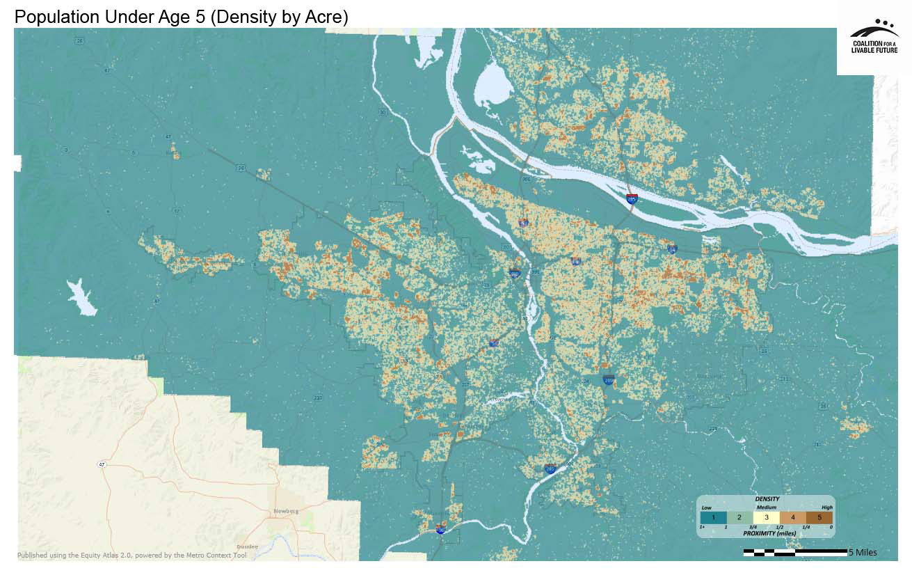
What this Map Can Tell Us
Like the Shape map, this Heatmap indicates that children under age five are not evenly distributed across the region. Instead, they are clustered into a kind of donut around the region’s urban core.
This map is able to show us with a much greater level of precision than the Shape map where people actually live. If we were to add the Location of Publicly Subsidized Housing Units Shape layer to this map, we would be able to compare the relationship between the locations of children under age five and the location of housing units with much greater specificity than we were able to with the Shape map, which shows population data averaged across census tracts.
What This Map Can’t Tell Us
As noted above, all of the underlying Heatmap data are converted into a 1 to 5 scale, and we cannot access the actual numerical values of the data from the mapping tool. For the proximity Heatmaps, the 1 to 5 scale represents actual distances, measured in quarter mile increments. For the density Heatmaps, the numerical values that correspond to the 1 to 5 scale vary from indicator to indicator. This means that while we can use this map to get a good understanding of how the distributions of children under age five vary across the region, we cannot use it to understand the actual numbers of children under age five in specific locations.
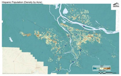
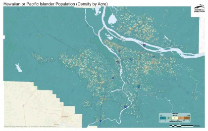
This also means that we cannot meaningfully compare the data in this map with the data in another density map because the scales for the scoring systems in the two maps may be different. For example, although the brown areas in the maps below show the places with the highest densities per acre of Hispanics and Hawaiian/ Pacific Islanders, the actual numeric values represented by the brown areas in each map are different. Because the overall numbers of Hawaiian/ Pacific Islanders in the Portland-Vancouver metro region are much smaller than the overall numbers of Hispanics in the region, the numbers of Hawaiian/ Pacific Islanders in the places with the highest densities of Hawaiian/ Pacific Islanders will be much smaller than the numbers of Hispanics in the places with the highest densities of Hispanics.
Using Maps to Analyze Equity
The Power of Maps: The Equity Atlas maps provide a unique and powerful way to analyze issues related to equity and opportunity in our region. The maps enable us to deal effectively with complex information by presenting data and relationships visually, rather than through dense text or tables. They help us to look at the entire picture while at the same time enabling us to zoom in to see specific areas in greater detail. And they allow information to be layered, enabling us to examine the relationships between different issues.
The Limitations of Maps: It is important to keep in mind the limitations of using maps to analyze equity when viewing the Equity Atlas maps:
- Maps frame issues geographically and spatially, but some equity issues aren’t geographic in nature and don’t lend themselves to being mapped.
- What we can map is limited by the available data. For many critical issues that are relevant to regional equity, data are not available in a format that would enable us to map those issues.
- Maps implicitly define issues of access in terms of geographic proximity to resources. Geographic proximity is one aspect of opportunity, but there are other aspects that aren’t effectively captured through maps.
The Equity Atlas includes other components beyond the maps in an effort to place the maps in a broader context that includes dimensions of equity that the maps cannot effectively capture. The Equity Atlas is also complemented by the work of a variety of other organizations across the region that examine disparities in other ways.