|
|
|
|
|
A core component of CLF’s definition of equity is that “all people have the power to shape the future of their communities through public decision-making processes that are transparent, inclusive, and engage the community as full partners.” This is not an issue that easily lends itself to being mapped. Mapping equitable access to democratic participation would require spatial data on factors such as:
These questions can be researched on a decision-by-decision or community-by-community basis, but there is no way to meaningfully map them at a regional scale. Consequently, the Atlas explores the issue of democratic participation through maps of the only available proxy for which mappable data are available: voter registration numbers and participation rates.
While voter information does not comprehensively address whether people have the power to shape the future of their communities, participation in elections is a fundamental way for citizens to affect public decision-making, and a necessary factor for a healthy democracy. This map series depicts the numbers of registered voters and voter participation rates mapped by census block group, allowing us to analyze variations in how citizens across the region participate in the democratic process.

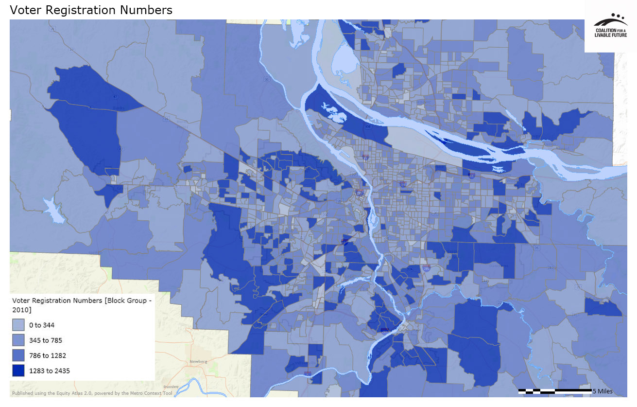
The Voter Registration Numbers map shows the number of registered voters by census block group. The map is simply a visualization of the number of registered voters in each block group, not the rate of voter registration. Census block groups are geographic areas that can range in size from 600 to 3,000 people, with a target size of 1,500 people. Larger block groups will show larger numbers of registered voters even if the voter registration rate (i.e. the number of registered voters divided by the total population of the census block group) is not particularly high. For this reason, the voter registration map is most useful in providing context for the voter participation maps.
The Voter Participation Rates – General Elections map shows the rate of voters who participated in the 2006, 2008, and 2010 general elections, out of the total number of registered voters in each block group. Areas with the highest rate of voter participation (56%-100%) are located throughout the region. These areas include:
It would be interesting to explore the demographic patterns in these block groups that might explain their higher rates of voter participation. The Atlas online mapping tool offers a range of data and maps that could help to inform such an analysis.
The Voter Participation – Primary Elections map shows the rate of voters who participated in the 2006, 2008, and 2010 primary elections, out of the total number of registered voters in each block group. Voters who consistently participate in primary elections are considered to be the most committed voters, making this map perhaps the most insightful of the three in this series.
The areas with the highest primary voter participation rates (29%-50%) are located throughout the region and tend to be in clusters of multiple block groups. These clusters include:
Perhaps not surprisingly, many of these block groups are located in areas with relatively high levels of educational attainment and household incomes. Interestingly, however, this is not uniformly the case. Several of the block groups with the highest primary voter participation rates are located in census tracts with median incomes that are below the regional median. Examples include block groups located in Raleigh Hills, parts of southeast Portland, the block group immediately south of Canby, and several block groups in Vancouver.
Areas with low primary voter participation rates are scattered in block groups throughout the region. Some of the largest clusters of these low-participation block groups are located in inner northeast and southeast Portland, outer east Portland and Gresham, parts of Sherwood-Tualatin, Beaverton, and Cedar Mills, and several neighborhoods in the central portion of Clark County.
The patterns in all three maps in this series generate a number of interesting questions for further analysis. How do block-level voter participation rates correlate with block-level demographic patterns? Do higher voter participation rates correspond with higher rates of engagement in other forms of democratic participation, such as involvement in neighborhood-level planning processes? Do higher voter participation rates in a given geographic area translate into greater responsiveness by elected leaders to the needs of those areas?
This map shows the number of registered voters as of June 2012. These figures are displayed by 2010 Census block groups. Voter registration data do not necessarily match the census population data due to census undercounting, the difference in timing between when census data were gathered and the voter registration data were pulled, and because registered voters do not always update their address information after they move. For this reason, it is not advisable to use the census population data to try to calculate voter registration rates.
Data Source: Voter Activation Network (2012)
This map shows the percent of registered voters that voted in the 2006, 2008, and 2010 general elections. This is calculated by dividing the number of voters that submitted ballots in the elections by the number of registered voters for that year.
Data Source: Voter Activation Network (2006/2008/2010)
This map shows the percent of registered voters that voted in the 2006, 2008, and 2010 primary elections. This is calculated by dividing the aggregate number of voters that submitted ballots in the elections by the aggregate number of registered voters for that year.
Data Source: Voter Activation Network (2006/2008/2010)