|
|
|
|
|
Our transportation systems play a key role in connecting the region’s residents to all of the other resources and opportunities the region provides. Good public transit can significantly enhance people’s ability to access work, school, retail and health services, and social activities. Public transit usage as an alternative to driving also provides health benefits through increased physical activity and reduced emissions.
Research has shown that proximity to transit stops as well as the frequency of transit service are important predictors of whether people use transit. Walkable access to good quality transit is also an essential resource for populations who don’t have the option of driving, either because they can’t afford to maintain a vehicle or are unable to drive. These transit-dependent populations include youth, seniors, people with disabilities, and people with low incomes.
This map series shows how access to transit varies across the region. It includes (a) a heatmap of transit access, measured by proximity to public transit stops and the frequency of trips through those stops; (b) a version of the transit access map that summarizes access by neighborhood; (c) a map comparing transit access to areas with above the regional average percent populations of seniors; and (d) a map comparing transit access to schools with 75% or more of students eligible for free or reduced price lunch, as a proxy for poverty.

The transit access map indicates that the neighborhoods with the best transit access in the region are generally located in Portland, relatively close to downtown. The Atlas mapping tool can be used to assign a proximity score to each neighborhood in the region based on the average proximity of every block in the neighborhood to transit. A score of “5” indicates proximities within ¼ mile, while a score of “1” or below indicates proximities greater than 1 mile. The ten neighborhoods with the highest transit access scores in the region are all located in close-in Portland:
|
Neighborhood |
Location |
Transit Access |
|---|---|---|
|
Downtown |
Portland |
3.59 |
|
Portland |
3.58 |
|
|
Goose Hollow |
Portland |
3.22 |
|
Lloyd District |
Portland |
3.17 |
|
Old Town/Chinatown |
Portland |
3.01 |
|
Hollywood |
Portland |
2.78 |
|
Multnomah County Unclaimed #6 (just west of the Hollywood District) |
Portland |
2.57 |
|
Sullivan’s Gulch |
Portland |
2.51 |
|
Homestead |
Portland |
2.38 |
|
Kerns |
Portland |
2.33 |
Of the 50 neighborhoods in the region with the highest transit access scores, all are in Portland except for:
|
Neighborhood |
Location |
Transit Access |
Rank in Top 50 |
|---|---|---|---|
|
Arnada |
Vancouver |
2.22 |
#15 |
|
Gresham-City Central |
Gresham |
2.10 |
#24 |
|
Central Beaverton |
Beaverton |
1.78 |
#50 |
Senior citizens are one of the demographic groups that tends to be most reliant on public transit. The Transit Access in Relationship to Areas with Above Regional Average Percent Seniors (Ages 65+) map indicates that the location of the senior population does not always align with the location of high transit access areas. There are quite a few census tracts close to Portland’s downtown that have high percentages of seniors and good transit access. And the region’s other key transit hubs – in Gresham, Beaverton, and Vancouver – are all adjacent to census tracts with high percentage of seniors. But many of the areas with the best transit access in parts of Portland’s close-in east and west sides have senior populations that are below the regional average. And many of the census tracts on the region’s periphery that have senior populations that are above the regional average have little to no public transit access. This mismatch should be examined further to determine potential implications for equity and for the health and quality of life of our region’s senior populations.
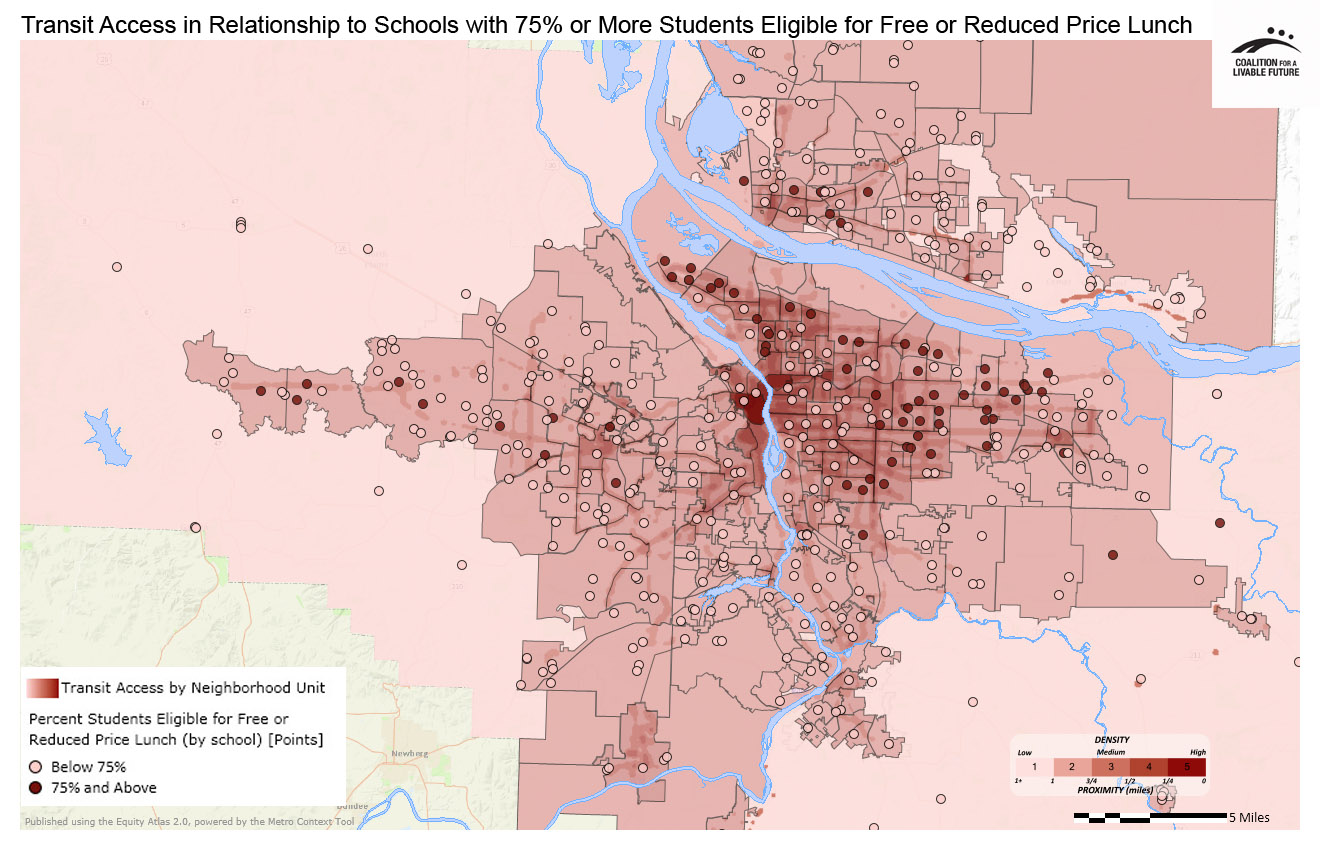
The Transit Access in Relationship to Schools with 75% or More of Students Eligible for Free and Reduced Price Lunch map indicates that there are many high poverty schools in the region that are located in neighborhoods with transit access that is below the regional average. In Multnomah County, this includes schools located in north Portland’s St. John’s neighborhood, outer east Portland’s Argay neighborhood, Gresham’s Wilkes-East and North Gresham neighborhoods, and Multnomah County Unclaimed #19 neighborhood (located along the Columbia River east of 33rd Avenue). In Clark County, this includes schools in Vancouver’s Fruit Valley neighborhood. In Washington County, it includes schools in Beaverton’s Cedar Hills-Cedar Mill North and Five Oaks/ Triple Creek neighborhoods, and schools in Hillsboro, Cornelius, and Forest Grove. In Clackamas County, it includes schools located in Canby, Welches, and Boring.
These patterns are significant from an equity perspective for two reasons. First, youth are among the region’s most transit-dependent populations. A lack of good public transit access near high poverty schools indicates that students in those schools may have reduced mobility, which could impact their ability to access resources and opportunities such as employment, after school activities, and social services.
Second, school free and reduced price lunch eligibility rates are a good proxy for neighborhood poverty levels. The map’s patterns suggest that many high poverty neighborhoods have poor transit access. This is particularly troubling since low-income residents tend to be highly dependent on public transit to access all of their daily needs, including access to employment. Given the frequent correlation between poverty and race, these patterns also suggest likely racial disparities in access to transit.
The maps in this series raise important questions about how equitable the access to transit is in our region. These questions merit additional exploration so that we can better understand the disparities in transit access affecting the region’s most transit-dependent populations, and so that we can identify the places where targeted investments will have the greatest impact in reducing these disparities.
This map shows proximity to public transit stops as well as the frequency of trips through those transit stops. For example, a bus stop that serves two high-frequency bus lines will receive a higher weighting than a stop that serves a single, less frequent line. The map includes TriMet bus, streetcar, and MAX, and C-Tran; it does not include some smaller bus lines that operate in a few rural communities.
Data Source: Metro RLIS (2012) and Clark County GIS (2012)
This map uses the same underlying data as the Transit Access Heatmap. Instead of showing the data as a heatmap, it aggregates the data by neighborhood-level geography. The darker the neighborhood, the higher the transit access rating.
Data Source: Metro RLIS (2012) and Clark County GIS (2012)
This map layers the census tracts with above the regional average percent seniors on top of the Transit Access Heatmap.
Data Source: Metro RLIS (2012), Clark County GIS (2012), U.S. Census (2010)
This map layers the Percent Students Eligible for Free and Reduced Price Lunch by school point layer on top of the Transit Access Heatmap.
Data Source: Oregon Department of Education & Washington Office of the Superintendent of Public Instruction (2011-2012); Metro RLIS (2012); Clark County GIS (2012)
*Some neighborhood boundaries overlap. The Atlas refers to the areas within the overlapping boundaries by the names of both neighborhoods.