|
|
|
|
|
Obesity, including child obesity, has risen dramatically in the past several decades, and research has shown a correlation between obesity rates and consumption of calorie-dense fast food and other unhealthy food options. Chronic health conditions such as diabetes and cardiovascular disease are also related to consumption of unhealthy food. These food options are often easier to access, less expensive, and more convenient than healthier options. Neighborhoods with high densities of unhealthy food sources in comparison to healthy food sources are often referred to as “food swamps." Studies have shown a direct link between the abundance of unhealthy foods and obesity in food swamp neighborhoods. National research indicates that food swamps tend to be disproportionately located in low-income neighborhoods.
This map series shows the distribution of unhealthy food sources by neighborhood and then compares these patterns with data on poverty and race.

The Atlas mapping tool can be used to assign a proximity score to every neighborhood in the region based on the average proximity of each block in the neighborhood to unhealthy food sources. A score of “5” indicates proximities within ¼ mile, while a score of “1” or below indicates proximities greater than 1 mile. The ten neighborhoods with the highest scores on the Proximity to Typical Sources of Unhealthy Food map are primarily located in close-in, densely populated neighborhoods. Most of these neighborhoods also have high proximities to grocery stores, and all but three have reasonably high proximity to farmers’ markets and produce stands. This suggests that in these neighborhoods, proximity to unhealthy food sources is primarily a function of population and retail density rather than an indication of a lack of access to healthy food:
|
Neighborhood |
Location |
Typical Sources of Unhealthy Food |
Supermarkets & Grocery Stores |
Farmers Markets & Produce Stands |
|---|---|---|---|---|
|
Multnomah County Unclaimed #6 (west of the Hollywood District) |
Portland |
5.00 |
4.86 |
3.43 |
|
Hazelwood/Mill Park |
Portland |
4.94 |
4.39 |
1.00 |
|
Grant Park/Hollywood |
Portland |
4.93 |
5.00 |
4.80 |
|
Old Town |
Lake Oswego |
4.93 |
4.75 |
3.89 |
|
Hough |
Vancouver |
4.85 |
3.60 |
3.58 |
|
Hollywood |
Portland |
4.84 |
4.94 |
4.57 |
|
Woodland Park |
Portland |
4.81 |
4.33 |
1.00 |
|
Humboldt |
Portland |
4.75 |
4.73 |
4.53 |
|
Boise |
Portland |
4.72 |
4.73 |
3.62 |
|
Ardenwald-Johnson Creek/Woodstock |
Portland |
4.71 |
3.91 |
1.00 |
The region does have some neighborhoods with high proximities to typical sources of unhealthy food and low proximities to supermarkets, grocery stores, farmers’ markets and produce stands. This pattern fits the profile for a food swamp, and may put the neighborhoods’ residents at greater risk for obesity and other diseases. The table below highlights a few examples.
|
Neighborhood |
Location |
Typical Sources of Unhealthy Food |
Supermarkets & Grocery Stores |
Farmers Markets & Produce Stands |
|
Centennial/Pleasant Valley |
Portland |
4.07 |
2.20 |
1.00 |
|
South Cliff |
Vancouver |
4.03 |
2.68 |
1.00 |
|
Bella Vista |
Vancouver |
4.02 |
1.52 |
1.00 |
|
Hudsons Bay |
Vancouver |
3.88 |
2.66 |
1.72 |
The Atlas mapping tool can be used to identify other neighborhoods across the region with a similar imbalance between the levels of unhealthy and healthy food sources.
The Proximity to Typical Sources of Unhealthy Food in Relationship to Areas with Above Regional Average Percent Populations in Poverty map indicates that many of the areas in the region with the greatest proximity to unhealthy food sources are located in census tracts that have above average percentages of populations in poverty. This is consistent with national research showing that food swamps tend to be disproportionately located in low-income neighborhoods.
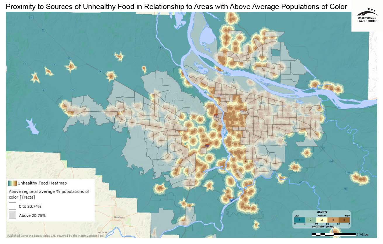
The patterns in the Proximity to Typical Sources of Unhealthy Food in Relationship to Areas with Above Regional Average Percent Populations of Color map are a bit more complex. Many areas with high proximity to unhealthy food sources are located in census tracts with above average percentages of populations of color. But there are also many census tracts, particularly further out from the urban core, with above average percentages of populations of color and low proximity to sources of unhealthy food.
Additional statistical analysis can be used to identify specific neighborhoods across the region where the presence of food swamps strongly correlates with race and income. When these maps are analyzed in combination with other Atlas maps, such as those showing the distribution of obesity and diabetes rates, they can help to prioritize key areas where targeted investments in improving access to healthy food could have significant impacts on residents’ health.
Lack of healthy eating habits and lack of physical activity can both contribute to obesity and to chronic diseases such as diabetes and cardiovascular disease. While this map series focuses on access to unhealthy food sources, other map series focus on factors that influence physical activity, including maps on proximity to Parks and Natural Areas and Transportation, and a Healthy Eating Active Living map series that considers both factors.
This map shows proximity to typical sources of unhealthy food. These were compiled from a list of NAICS codes (North American Industry Classification System) that includes fast-food restaurants, convenience stores, beer, wine, and liquor stores, and gasoline stations with convenience stores.
While fast food restaurants, convenience stores, and liquor stores are typically sources of unhealthy food and drink options, the data for this indicator are limited to NAICS classification codes which don't distinguish between the "typical" convenience store or fast food restaurant and those that offer more healthy options.
Data Source: ESRI Business Analyst (2010)
This map uses the same underlying data as the Proximity to Typical Sources of Unhealthy Food Heatmap. Instead of showing the data as a heatmap, it aggregates the data by neighborhood. The darker the neighborhood, the higher the proximity score.
Data Source: ESRI Business Analyst (2010)
This map layers the census tracts with populations in poverty above the regional average on top of the Proximity to Typical Sources of Unhealthy Food heatmap.
Data Source: American Community Survey 5-Year Estimates (2006-2010), ESRI Business Analyst (2010)
This map layers the census tracts with populations of color above the regional average on top of the Proximity to Typical Sources of Unhealthy Food heatmap.
Data Source: American Community Survey 5-Year Estimates (2006-2010), ESRI Business Analyst (2010)