|
|
|
|
|
Diabetes is a chronic disease that has a significant impact on quality of life and well-being. The number of people with diabetes in the United States has been increasing at a troubling rate, making this a key public health concern. Of additional concern is the fact that diabetes prevalence nationally is higher among populations of color than among whites. National research also suggests a significant correlation between diabetes and poverty rates.
Diabetes occurs when the body cannot produce or respond appropriately to insulin. Without proper insulin regulation, blood glucose levels become elevated, which can lead to the development of serious, disabling complications. Diabetes lowers life expectancy and can cause long-term health complications including heart disease, kidney failure, and adult-onset blindness.
Type 2 diabetes is the most common form of diabetes, affecting 90% to 95% of Americans with diabetes. Obesity and lack of physical activity are linked closely with this form of diabetes, although genetic disposition also plays an important role. Rates of type 2 diabetes have increased significantly in recent decades, paralleling an increase in population obesity.
This map series shows how diabetes rates in the metro area compare with demographic patterns and with factors in the built and natural environment that affect healthy eating and active living. It includes maps of (a) diabetes rates by census tract; (b) diabetes rates in relationship to the percentage of students eligible for free or reduced price lunch; (c) diabetes rates in relationship to populations of color; and (d) diabetes rates in relationship to factors that affect healthy eating and active living.

Note: Although the Diabetes Rates map includes data for some Clark County census tracts, these data should be interpreted with caution. The map is based on data submitted to the Oregon Health Care Quality Corporation, which collects insurance claims data for health plans operating in Oregon. Some of the participating health plans submit claims data for members living in Clark County, but many do not. For this reason, the Clark County data are based on a limited population of Clark County residents and may not be representative of the entire population. The analysis of the maps in this series will therefore focus only on the portions of the region located in Oregon.
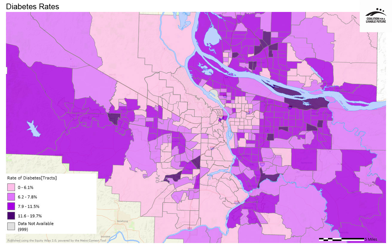
The most notable pattern in the Diabetes Rates map is that the lowest rates of diabetes tend to be clustered in a large swath of census tracts in the geographic center and west sides of the region. The census tracts with the lowest diabetes rates (0%-6.1%) are primarily located in Portland’s inner east and west sides, unincorporated Washington County north of US-26, and census tracts in Lake Oswego, West Linn, Wilsonville, Tigard, Beaverton, and Tualatin as well as unincorporated areas near these cities.
The census tracts with the highest diabetes rates (11.6%-19.7%) are scattered throughout the region. They include census tracts located in Fairview, Troutdale, Gresham, a small number of census tracts in Portland’s outer east side, one census tract in Milwaukie, one adjacent to Gladstone, one in Canby, and several in and adjacent to King City, Tigard, and Hillsboro.
The other maps in this series help to make sense of the patterns in the Diabetes Rates map by showing the relationships between diabetes rates, demographic patterns, and factors in the built environment.
The Diabetes Rates in Relationship to Percent Students Eligible for Free or Reduced Price Lunch map shows a strong relationship between the locations of low-poverty schools and the census tracts with the lowest diabetes rates. Conversely, almost all of the region’s high poverty schools are located in census tracts with diabetes rates that are relatively high, at 7.9%-11.5%. This pattern is consistent with national research demonstrating a significant correlation between diabetes prevalence and poverty rates.
The Diabetes Rates in Relationship to Populations of Color map suggests a similar connection between diabetes rates and race. The census tracts with the lowest diabetes rates tend to be located in parts of the region with lower densities of populations of color. Conversely, the areas with the highest densities of populations of color (the darker brown clusters on the map) tend to be located in census tracts with diabetes rates in the mid- to high-levels of the range (6.2%-11.5%). As with most patterns in the Atlas, this pattern is not uniformly true, but its relative consistency across the region is nonetheless striking. The patterns in this map and the previous map raise compelling questions about disparities in diabetes rates related to income and race, with potentially significant implications for policy and planning.
Given the scientific connection between diabetes and obesity, one would expect to see a strong correlation between diabetes rates and access to factors that influence healthy eating and active living (HEAL), such as access to transit, walkable neighborhoods, healthy food, parks and recreation. (For more information on the Healthy Eating Active Living Composite map and the HEAL concept, see the Healthy Eating Active Living map series.) The Diabetes Rates in Relationship to Healthy Eating Active Living Composite map highlights some areas in the region that have high HEAL scores and low diabetes rates. Conversely, almost all of the census tracts in the region with the highest diabetes rates are located in areas with low HEAL scores.
Despite these patterns, there appear to be just as many places where diabetes rates and HEAL scores do not neatly align. For example, the HEAL scores are very high in areas of north and northeast Portland where diabetes rates are also relatively high. Conversely, the HEAL scores are relatively low across most of the large swath of census tracts along the west side of the Willamette river where diabetes rates are almost uniformly low. And one of the two Gresham census tracts with the highest rates of diabetes is located in the area of Gresham with the highest HEAL score.
This suggests that while healthy eating and active living play an important role in preventing and managing diabetes among individual patients, physical proximity to factors that influence these behaviors may not be enough in itself to significantly affect diabetes rates across the population. Or it may be that physical proximity to HEAL factors is an important piece of the equation, but may have less of an impact on population-level diabetes rates than other factors such as race and income.
This map is based on data provided by the Oregon Health Care Quality Corporation. It depicts participating insurance plan members, ages 18-75, who were identified as having diabetes during 2011 or 2010. This status was determined based on both pharmacy and claim/encounter data. These data include administrative claims (billing) data from eight commercial health plans, two Medicaid managed care plans and the Oregon Health Authority Division of Medical Assistance Programs (Medicaid). The data for this indicator come from health insurance claims records, so they do not include data on uninsured patients, patients who pay for their own health care services, Medicare fee-for-service patients, or patients served by a plan or Medicaid provider that does not supply data to the Oregon Health Care Quality Corporation. The data, therefore, do not represent all persons living within a census tract. The data were first geocoded by patient address and then aggregated into census tracts in order to maintain confidentiality.
Data Source: Oregon Health Care Quality Corporation (2011)
This map layers the Percent Students Eligible for Free or Reduced Price Lunch point layer on top of the Diabetes Rates map.
Data Source: Oregon Health Care Quality Corporation (2011); Oregon Department of Education & Washington Office of the Superintendent of Public Instruction (2011-2012)
This map layers the Healthy Eating Active Living (HEAL) Composite density map with the Diabetes Rates map.
Data Source: Oregon Health Care Quality Corporation (2011); Metro RLIS (2012); Clark County GIS (2012); U.S. Department of Agriculture (2012); Portland Farmers' Market (2012); Oregon Environmental Council (2012); ESRI Business Analyst (2010)
This map layers the Populations of Color (Density by Acre) map with the Diabetes Rates map.
Data Source: U.S. Census (2010); Oregon Health Care Quality Corporation (2011)