|
|
|
|
|
The Portland metro region has become increasingly racially and ethnically diverse over the past 30 years, and populations of color are the fastest growing segment of the region’s population. But despite their increasingly important role in the region, populations of color continue to be challenged by persistent racial disparities that affect their ability to thrive and flourish. To create an equitable region, all people must have the opportunity to achieve their full potential and realize their vision for success.
Understanding how the geographic distribution of our region’s populations of color corresponds with the distribution of resources and opportunities is essential to our analysis of regional equity. The maps in this series show the distribution of the region’s populations of color by race. Comparing the race maps with the Atlas’ other maps highlights the region’s patterns of inequity and can help to inform strategies to address disparities.
The maps in this series rely on 2010 Census data because it is the only comprehensive data that can be used to map race. However, the Census categories do not capture the full range of racial and ethnic identities within the population, and requiring respondents to define themselves using these categories may render some populations invisible. The Census also under-represents populations of color due to historic patterns of under-counting. While the 2010 Census is the most reliable count of the nation’s population available, it is important to remember these limitations when analyzing the maps in this series.

Collectively, these maps depict the current settlement patterns of the region’s communities of color. Some of the settlement patterns highlighted in the maps reflect remnants of a historic legacy of segregation overlaid with more recent changes related to displacement and gentrification. Some of the patterns reflect the influx of new residents to areas of the region with more affordable housing. And some of the patterns reflect the tendency for populations to settle close to employment opportunities, especially in the agricultural industry. The unique patterns for each population group—African Americans, Asians, Hispanics, Native Americans and Native Hawaiians/Pacific Islanders—are described below.
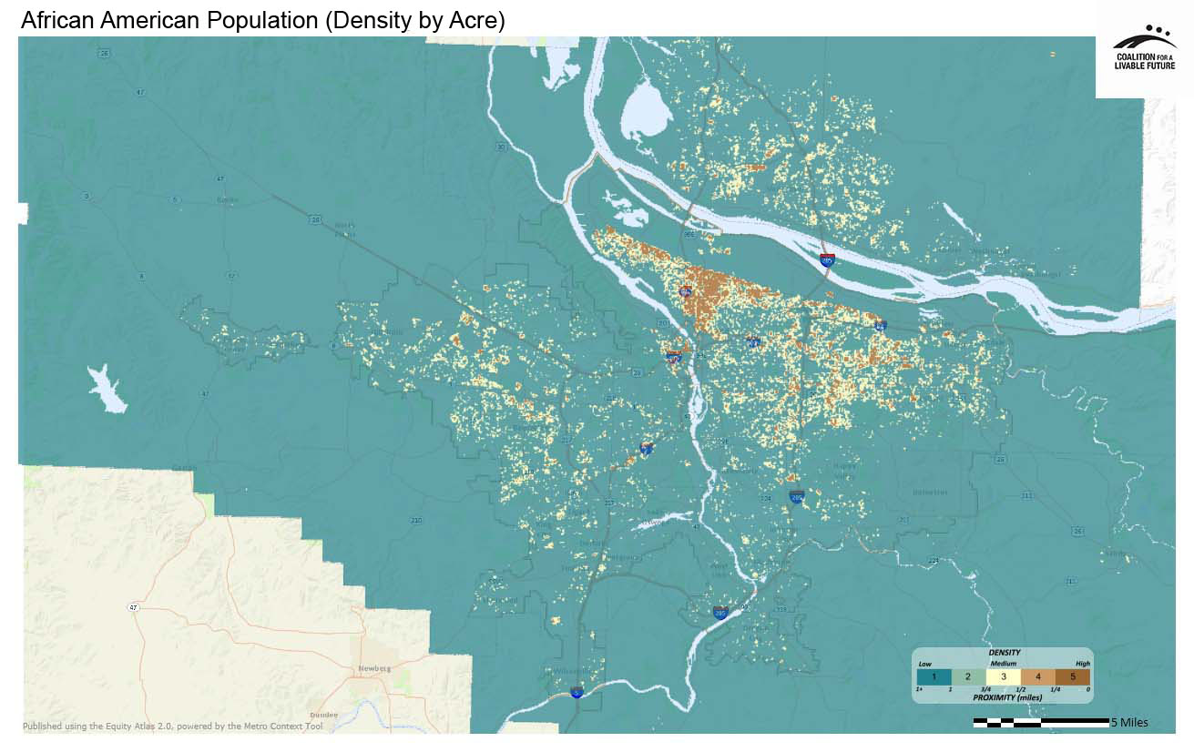
The African American community is centered in north and inner northeast Portland. There are also dense clusters of African American residents in outer east Portland and Gresham, beyond Interstate 205.
In contrast to the north and northeast Portland-centric population pattern of African Americans in the region, the Asian population is concentrated along the I-205 corridor in outer east Portland and in central Washington County.
The Hispanic population is most concentrated in the inner suburbs (Hillsboro, Beaverton, Gresham, Wood Village), the city of Cornelius, sections of Vancouver and north and outer east Portland. (Note: The term “Hispanic” is used throughout this analysis, because that is the term used by the Census Bureau.)
In contrast to the three populations described above, the Native American population appears to be dispersed throughout the region. Multnomah County has the highest average density of Native American residents in the region. Similarly, the Native Hawaiian/Pacific Islander population is dispersed throughout the region.
On their own, these maps enable us to compare and contrast where communities of color live and explore the unique settlement patterns of each racial/ ethnic group. From an equity perspective, these maps can also be used in conjunction with other maps depicting the distribution of the region’s opportunities and resources (such as proximity to community amenities or access to high-performing schools). They serve an important foundational role in exploring equity in the region.
All of the maps in this series show the density, per acre, of specific populations based on U.S. Census race/ethnicity categories. The data are mapped using an overcount methodology — if a respondent checked three race categories, he/she is included in each of the relevant density maps.
This map shows the density, per acre, of African American populations as documented by the 2010 U.S. Census.
Data Source: U.S. Census 2010 (QT-P6 Race Alone or in Combination and Hispanic or Latino); Universe = Total Population
This map shows the density, per acre, of non-white, Hispanic populations as documented by the 2010 U.S. Census.
Data Source: U.S. Census 2010 (QT-P6 Race Alone or in Combination and Hispanic or Latino); Universe = Total Population
This map shows the density, per acre, of Asian populations as documented by the 2010 U.S. Census.
Data Source: U.S. Census 2010 (QT-P6 Race Alone or in Combination and Hispanic or Latino); Universe = Total Population
This map shows the density, per acre, of Native American or Alaskan Native populations as documented by the 2010 U.S. Census.
Data Source: U.S. Census 2010 (QT-P6 Race Alone or in Combination and Hispanic or Latino); Universe = Total Population
This map shows the density, per acre, of Hawaiian or Pacific Islander populations as documented by the 2010 U.S. Census.
Data Source: U.S. Census 2010 (QT-P6 Race Alone or in Combination and Hispanic or Latino); Universe = Total Population
Note:
It is important to keep in mind that for the density heatmaps in the Atlas mapping tool, particularly for the demographic indicators, the statistics represent relative rather than absolute numbers. For example, a score of “5” on the Hispanic density map represents the areas with the highest densities of Hispanics in the region; a score of “5” on the Hawaiian/Pacific Islander map represents the areas with the highest densities of Hawaiian/Pacific Islanders in the region. However, because the overall number of Hispanics in the region is much higher than the overall number of Hawaiian/Pacific Islanders, census tracts, neighborhoods, cities, and counties with the highest densities of Hispanics will have larger absolute numbers of Hispanics than the same areas with the highest densities of Hawaiian/Pacific Islanders. What this means is that you can use the statistics to compare the relative densities of the Hispanic population across different geographic areas, but you cannot use the "1" to "5" scores to compare the actual numbers of Hispanics with the actual numbers of Hawaiian/Pacific Islanders in a geographic area.