|
|
|
|
|
Walkability and transit access are closely linked. People are less likely to use transit if they are unable to safely and easily walk to and from the transit stop. Similarly, people are more likely to walk if they can supplement walking with public transit for longer trips.
This map series creates a “pedestrian composite” by combining the walkability and transit access maps. The composite map is displayed as both a heatmap and as a map that summarizes pedestrian access by neighborhood. The composite map is then layered with various demographic maps to show how pedestrian access compares with the distribution of (a) poverty; (b) populations of color; and (c) census tracts with above the regional average population of seniors.

Note: The walkability maps do not include data for Clark County, so this analysis is limited to the Oregon portion of the four-county region.
The Pedestrian Composite maps indicate that the largest continuous areas in the region with high levels of pedestrian access (defined as a combination of sidewalk density and proximity to transit, and shown in dark brown on the map) are primarily located in older neighborhoods in the city of Portland west of I-205. There are also several places in the region with high levels of pedestrian access covering a fairly large area but where the coverage is more diffuse and less continuous than in Portland. These areas are located in parts of Gresham, Milwaukie, Wilsonville, Tigard, Beaverton, Hillsboro, unincorporated areas of Washington County adjacent to Beaverton and Hillsboro, King City, and Cornelius. Some additional hotspots with high levels of pedestrian access in a single, targeted geographic area are located in Oregon City, Gladstone, Happy Valley, Johnson City, Lake Oswego, Sherwood, and Tualatin.
The Pedestrian Composite in Relationship to Areas with Above Regional Average Populations in Poverty map indicates that many parts of the region with the highest levels of pedestrian access are located in census tracts with populations in poverty above the regional average. But there are also many census tracts with populations in poverty above the regional average that do not have good pedestrian access, particularly in the less urbanized parts of the region.
In the high poverty census tracts that overlap with pedestrian access hotspots, it is important to note that the census tracts are typically much bigger than the pedestrian access hotspots, and we do not have sufficient data to determine where in the census tracts the populations in poverty are located. Given the large size of some census tracts, this makes it difficult to determine how well the populations in poverty can access the pedestrian hotspots.
In Portland, roughly half of the areas with the highest pedestrian access are located in census tracts with above regional average populations in poverty, and roughly half are not. Those with below average populations in poverty tend to be located in Portland’s west side and inner and central east sides. Because the areas with high levels of pedestrian access in Portland are relatively continuous rather than being isolated hotspots, we can assume that the populations in poverty in these areas do have good pedestrian access.
The Pedestrian Composite in Relationship to Areas with Above Regional Average Populations of Color map shows a similar pattern to the poverty overlay map. Many of the areas in the region with the highest levels of pedestrian access are located in census tracts with populations of color that are above the regional average. But as with the poverty overlay map, because we don’t know exactly where in each census tract the populations of color live, it is difficult to know how well these populations can access the pedestrian hotspots. The patterns in Portland are very similar to the poverty overlay map – roughly half the areas in Portland with high pedestrian access are located in census tracts with populations of color that are above the regional average.
Several census tracts around the region with above average populations of color have very low levels of pedestrian access. These census tracts are primarily located in unincorporated areas of Washington County. Quite a few census tracts with above average populations of color appear to have mediocre levels of pedestrian access. These include census tracts in parts of east Multnomah County, Happy Valley and adjacent unincorporated areas, and several census tracts in the urbanized areas of Washington County.
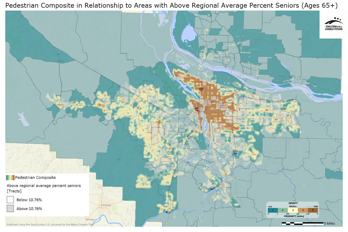
The Pedestrian Composite in Relationship to Areas with Above Regional Average Percent Seniors (Ages 65+) map shows a more consistent pattern of disparities than the previous overlay maps. In the city of Portland, fewer of the areas with high levels of pedestrian access have senior populations above the regional average than with the previous maps. The primary exceptions tend to be located on Portland’s west, south, and central east sides. In the rest of the region, many of the pedestrian access hotspots around the region are not located in census tracts with above the regional average percent of seniors, although some are. Conversely, many of the census tracts in the outlying portions of the region with above the regional average percent of seniors do not have good pedestrian access.
The maps in this series highlight areas around the region where key populations have poor access to transit and walkable neighborhoods. These findings raise important questions for further research. In order to determine which of these neighborhoods might be priorities for investments to improve pedestrian access, we need to understand how these patterns correlate with other relevant factors such as population densities and levels of transit dependency. The Atlas demographic heatmaps can also be used to conduct a more fine-grained analysis of where specific populations live in relationship to pedestrian hotspots in particular neighborhoods.
This map shows the density of sidewalk coverage as a measure of the walkability of a particular area. It is based on a 1/4 mile radius, which is generally accepted as a reasonable walking distance. Unfortunately, good data on sidewalk coverage are not available for Clark County, so the map only includes meaningful data for the Oregon portion of the four-county region.
Data Source: Metro RLIS (2012)
This map shows proximity to public transit stops as well as the frequency of trips through those transit stops. For example, a bus stop that serves two high-frequency bus lines will receive a higher weighting than a stop that serves a single, less frequent line. The map includes TriMet bus, streetcar, and MAX, and C-Tran; it does not include some smaller bus lines that operate in a few rural communities.
Data Source: Metro RLIS (2012) and Clark County GIS (2012)
This map combines the data from the Walkability-Sidewalk Density and Transit Access maps to create a composite heatmap. Again, good data on sidewalk coverage are not available for Clark County, so the map is only valid for the Oregon portion of the four-county region.
Data Source: Metro RLIS (2012) and Clark County GIS (2012)
This map uses the same underlying data as the Pedestrian Composite Heatmap, but instead of showing the data as a heatmap, it aggregates the data by neighborhood.
Data Source: Metro RLIS (2012) and Clark County GIS (2012)
This map layers the census tracts with above the regional average percent populations in poverty on top of the
Pedestrian Composite Heatmap.
Data Source: American Community Survey 5-Year Estimates (2006-2010); Metro RLIS (2012); Clark County GIS (2012)
This map layers the census tracts with above the regional average percent populations of color on top of the Pedestrian Composite Heatmap.
Data Source: Metro RLIS (2012), Clark County GIS (2012), U.S. Census (2010)
This map layers the census tracts with above the regional average percent seniors on top of the Pedestrian Composite Heatmap.
Data Source: Metro RLIS (2012), Clark County GIS (2012), U.S. Census (2010)