|
|
|
|
|
Complex factors influence people’s opportunities to make lifestyle and behavioral choices that are healthy for their bodies and good for the environment. Research has shown that when people live in walkable neighborhoods with good access to transit, where healthy food is easily available, and where parks and recreation facilities are easy to access, they are much more likely to engage in healthy eating and active living. This in turn increases their ability to maintain a healthy weight and lowers their risk of various diseases.
This map series shows individual and composite maps for a range of factors that affect people’s ability to engage in healthy eating and active living: proximity to supermarkets, grocery stores, farmers’ markets and produce stands; transit access; walkability; proximity to recreation facilities; and proximity to publicly accessible parks.
The factors that contribute to healthy eating and active living are often referred to collectively as HEAL. The Healthy Eating Active Living Composite map enables us to compare how well each neighborhood in the region promotes healthy eating and active living by generating a “HEAL score” for each neighborhood in the region.
The HEAL composite map is used as an overlay in several other map series in the Health Outcomes section of the Atlas website to analyze the connection between HEAL factors and key health outcomes such as obesity, cardiovascular disease rates, and diabetes rates. These maps demonstrate what appears to be a strong relationship between the presence of factors that promote healthy eating and active living, and population-level health outcomes.

The Atlas online mapping tool can be used to assign a proximity score to every neighborhood in the region based on the average proximity of each block in the neighborhood to transit, food, parks, recreation, and walkable neighborhoods. A score of “5” indicates proximities within ¼ mile, while a score of “1” or below indicates proximities greater than 1 mile. The Healthy Eating Active Living Composite map shows that the neighborhoods with the highest proximity scores tend to be located in the region’s core, particularly in the closer-in neighborhoods of the city of Portland. The Atlas online mapping tool provides detailed information on these neighborhoods, showing how each of the elements of the HEAL composite contributes to the neighborhood’s overall HEAL score. An analysis of the characteristics of both the high scoring and low scoring neighborhoods can help to inform efforts to promote healthier lifestyles through strategic investments and planning decisions.
The ten neighborhoods with the highest HEAL access scores in the region are all in Multnomah County, and almost all are in neighborhoods close to downtown Portland:
|
Neighborhood |
Location |
Supermarkets & Grocery Stores |
Farmers' Markets & Produce Stands |
Parks |
Recreation |
Transit |
Walkability |
|---|---|---|---|---|---|---|---|
|
Portland |
5.00 |
4.80 |
4.87 |
3.67 |
2.07 |
5.00 |
|
|
Hollywood |
Portland |
4.94 |
4.57 |
4.46 |
3.40 |
2.78 |
4.78 |
|
Humboldt |
Portland |
4.73 |
4.53 |
4.85 |
3.48 |
2.23 |
4.95 |
|
Goose Hollow |
Portland |
4.80 |
3.82 |
4.96 |
3.30 |
3.22 |
4.64 |
|
Lloyd District/Sullivan’s Gulch |
Portland |
4.00 |
4.32 |
5.00 |
4.05 |
3.58 |
3.37 |
|
Multnomah County Unclaimed #6 (west of the Hollywood District) |
Portland |
4.86 |
3.43 |
5.00 |
4.00 |
2.57 |
4.29 |
|
Mt. Scott-Arleta |
Portland |
4.39 |
4.15 |
4.73 |
4.00 |
1.90 |
4.85 |
|
Downtown |
Portland |
4.47 |
4.15 |
4.67 |
2.24 |
3.59 |
4.26 |
|
Buckman |
Portland |
4.30 |
4.42 |
4.45 |
3.40 |
2.32 |
4.51 |
|
Creston-Kenilworth |
Portland |
4.60 |
3.19 |
4.77 |
4.23 |
2.10 |
4.42 |
|
Lloyd District |
Portland |
3.86 |
4.25 |
4.47 |
3.04 |
3.17 |
4.18 |
Other HEAL hot spots are located in neighborhoods throughout the region. These include:
|
Neighborhood |
Location |
Supermarkets & Grocery Stores |
Farmers' Markets & Produce Stands |
Parks |
Recreation |
Transit |
Walkability |
|---|---|---|---|---|---|---|---|
|
Gresham-City Central |
Gresham |
3.72 |
4.23 |
4.57 |
3.84 |
2.10 |
3.28 |
|
Arnada |
Vancouver |
4.50 |
4.37 |
4.70 |
3.64 |
2.22 |
|
|
McLoughlin |
Oregon City |
3.02 |
3.47 |
4.65 |
4.26 |
1.50 |
3.20 |
|
Evergreen |
Lake Oswego |
4.58 |
4.06 |
4.61 |
3.17 |
1.44 |
2.08 |
|
Vose |
Beaverton |
3.99 |
1.94 |
4.68 |
3.21 |
1.29 |
3.41 |
|
Central Beaverton |
Beaverton |
4.02 |
2.25 |
4.61 |
2.80 |
1.78 |
2.80 |
|
Hough |
Vancouver |
3.60 |
3.58 |
4.52 |
4.12 |
1.47 |
N/A |
The neighborhoods with the lowest HEAL scores in the region are primarily located in unincorporated areas and neighborhoods with low population densities. Interestingly, the ten neighborhoods with the lowest HEAL scores are all located in Multnomah and Clark counties. They include Multnomah County’s Hayden Island, Linnton, and Northwest Industrial neighborhoods, and Clark County’s West Hazel Dell, North Fork Lewis River, Meadow Glade, Fern Prairie, Ridgefield Junction, and Proebstel neighborhoods.
This map shows proximity to food retailers that are identified as supermarkets and grocery stores via NAICS (North American Industry Classification System) codes. While proximity to supermarkets and grocery stores does not necessarily translate into access to healthy food, it is often a baseline requirement. Unfortunately, comprehensive data are not available to enable us to map other factors affecting access to healthy food, such as the freshness, affordability, and healthfulness of the food available at a given store. This map also does not include convenience stores or corner markets, some of which carry healthier options.
Data Source: ESRI Business Analyst (2010)
This map shows access to fresh produce based on geographic proximity to produce stands, fruit and vegetable markets, and farmers’ markets. As with the Proximity to Supermarkets and Grocery Stores map, this map only addresses one dimension of food access. Unfortunately, data on the affordability of the fresh produce at these retailers are not available.
Data Source: U.S. Department of Agriculture (2012); Portland Farmers' Market (2012); Oregon Environmental Council (2012) ESRI Business Analyst (2010)
This map shows proximity to public transit stops as well as the frequency of trips through those transit stops. For example, a bus stop that serves two high-frequency bus lines will receive a higher weighting than a stop that serves a single, more limited frequency line. The map includes bus, streetcar, MAX and C-Tran; it does not include some smaller bus lines that operate in a few rural communities.
Data Source: Metro RLIS (2012) and Clark County GIS (2012)
This map shows the density of sidewalk coverage as a measure of the walkability of a particular area. It is based on a 1/4 mile radius, which is generally accepted as a reasonable walking distance. Unfortunately, good data on sidewalk coverage are not available for Clark County, so the map only includes the portions of the region located in Oregon.
Data Source: Metro RLIS (2012)
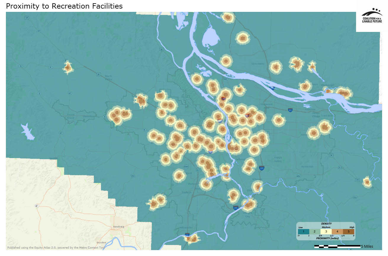
This map shows proximity to publicly owned and publicly accessible recreation facilities, many of which are located in public parks and greenspaces and operated by local parks departments. It includes swimming pools, tennis courts, sports fields, community centers, stadiums, and fairgrounds. The map does not include private recreation facilities such as health clubs, gyms, and private swimming pools.
Data Source: Metro RLIS (2012) and Clark County GIS (2012)
This map shows proximity to parks that are open to public use, regardless of whether they are publicly owned. Parks are defined as active or passive recreation areas where facilities exist that are primarily intended for recreational uses by the public. Proximity is measured based on street grid access to park entrances.
Data Source: Metro RLIS (2012) and Clark County GIS (2012)
This map combines the proximity scores from each of the other maps in this series to create a composite heatmap.
Data Source: Metro RLIS (2012), Clark County GIS (2012), U.S. Department of Agriculture (2012); Portland Farmers' Market (2012); Oregon Environmental Council (2012); ESRI Business Analyst (2010)
This map uses the same underlying data as the Healthy Eating Active Living Composite Heatmap, but instead of showing the data as a heatmap, it aggregates the data by neighborhood. The darker the neighborhood, the higher the HEAL score.
Data Source: Metro RLIS (2012), Clark County GIS (2012), U.S. Department of Agriculture (2012); Portland Farmers' Market (2012); Oregon Environmental Council (2012); ESRI Business Analyst (2010)
* Some neighborhood boundaries overlap. The Atlas refers to the areas within the overlapping boundaries by the names of both neighborhoods.
** Sidewalk density data for Clark County are incomplete, so the walkability scores should not be used for Clark County neighborhoods.