|
|
|
|
|
Access to healthy food is shaped by multiple factors including geographic proximity to food retailers that sell healthy offerings, and the affordability and cultural appropriateness of the food sold by those retailers. Unfortunately, data are not available that would enable us to map the healthfulness, affordability, or cultural appropriateness of the food available across the region. What we can map is the geographic locations of full service grocery stores, supermarkets, and specialty retailers. Research has shown that the presence of a supermarket in a neighborhood typically correlates with higher rates of fruit and vegetable consumption and reduced obesity rates.
This map series shows the distribution of supermarkets, grocery stores, farmers’ markets, and produce stands. It also includes maps showing how this distribution relates to population demographics, focusing on populations in poverty and populations of color.
The Atlas maps measure proximity to food retailers based on a standard of walkable access. While most people in the region probably do not walk to the grocery store, living within walkable distance to a grocery store is an important component of community livability. Whether or not residents have a grocery store close to home also can be a measure of neighborhood “completeness.” But we also need to recognize that many residents, particularly those with low incomes, travel significant distances to shop at stores that are more affordable than the ones in their neighborhoods. For that reason, a more complete analysis of food access would also need to include an analysis of transit access to food stores.

The Proximity to Supermarkets and Grocery Stores map indicates that geographic access to grocery stores and supermarkets tends to be strongest in Portland’s closer-in neighborhoods. The Atlas mapping tool can be used to assign a proximity score to every neighborhood in the region based on the average proximity of each block in the neighborhood to a supermarket or grocery store. A score of “5” indicates proximities within ¼ mile, while a score of “1” or below indicates proximities greater than 1 mile. Of the ten neighborhoods across the region with the highest proximity to supermarkets and grocery stores, nine are located in Portland, west of I-205:
|
Neighborhood |
Location |
Proximity to Supermarkets and Grocery Stores |
|---|---|---|
|
Portland |
5.00 |
|
|
Hollywood |
Portland |
4.94 |
|
Multnomah County Unclaimed #6 (west of Hollywood District) |
Portland |
4.86 |
|
Goose Hollow |
Portland |
4.80 |
|
Vernon |
Portland |
4.80 |
|
Sabin/Irvington |
Portland |
4.78 |
|
Old Town |
Lake Oswego |
4.75 |
|
Humboldt |
Portland |
4.73 |
|
Boise |
Portland |
4.73 |
|
Sabin |
Portland |
4.69 |
Proximity to grocery stores and supermarkets is lowest in industrial areas and low-density rural areas. The ten neighborhoods with the lowest proximity scores are:
|
Neighborhood |
Location |
Proximity to Supermarkets and Grocery Stores |
|---|---|---|
|
Multnomah County Unclaimed #2 (along Columbia River east of Bridgeton) |
Portland |
0.00 |
|
Linnton |
Portland and unincorporated Multnomah County |
0.78 |
|
East Old Evergreen Highway |
Vancouver |
0.82 |
|
West Hazel Dell |
Vancouver |
0.87 |
|
Old Evergreen Highway |
Vancouver |
0.88 |
|
Ladd Hill |
Wilsonville and unincorporated Clackamas County |
0.98 |
|
North Folk Lewis River |
Unincorporated Clark County |
0.98 |
|
Far West |
Wilsonville and unincorporated Clackamas County |
0.99 |
|
Forest Park/Northwest District |
Portland |
1.00 |
|
Cimarron |
Vancouver |
1.00
|
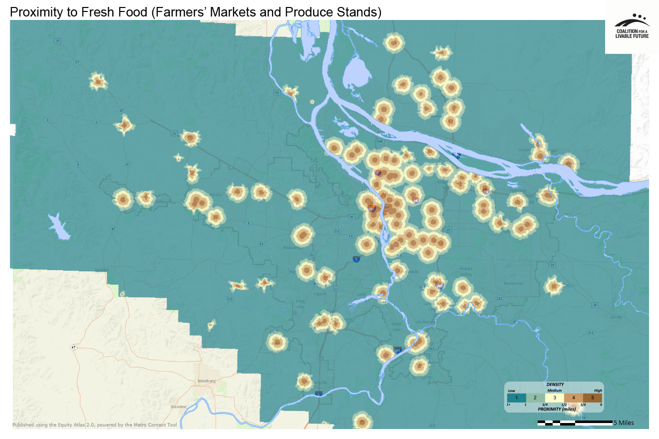
Portland’s Hollywood neighborhood and other neighborhoods close to downtown also feature strongly in the Proximity to Fresh Food (Farmers’ Markets and Produce Stands) map. Eight of the ten neighborhoods closest to farmers’ markets and produce stands are located in the city of Portland, with Vancouver’s Arnada neighborhood and Lake Oswego’s Foothills neighborhood also earning spots on the list:
|
Neighborhood |
Location |
Proximity to Farmers' Markets and Produce Stands |
|---|---|---|
|
Grant Park/Hollywood |
Portland |
4.80 |
|
Hollywood |
Portland |
4.57 |
|
Humboldt |
Portland |
4.53 |
|
Buckman |
Portland |
4.42 |
|
Arnada |
Vancouver |
4.37 |
|
King |
Portland |
4.36 |
|
Foothills |
Lake Oswego |
4.35 |
|
Lloyd District/Sullivan’s Gulch |
Portland |
4.32 |
|
Lloyd District |
Portland |
4.25 |
|
Eastmoreland/Reed |
Portland |
4.25 |
Most of the ten neighborhoods with the lowest proximities to farmers’ markets and produce stands are industrial or commercial in character and are primarily located in Portland and Vancouver on either side of the Willamette and Columbia rivers:
|
Neighborhood |
Location |
Proximity to Farmers' Markets and Produce Stands |
|---|---|---|
|
Multnomah County Unclaimed #2 (along Columbia River east of Bridgeton) |
Portland |
0.00 |
|
West Hazel Dell |
Vancouver |
0.47 |
|
Bridgeton |
Portland |
0.60 |
|
Riverview |
Vancouver |
0.62 |
|
Hayden Island |
Portland and unincorporated Multnomah County |
0.68 |
|
East Old Evergreen Highway |
Vancouver |
0.71 |
|
Northwest Industrial |
Portland |
0.76 |
|
Linnton |
Portland and unincorporated Multnomah County |
0.77 |
|
Fruit Valley |
Vancouver and unincorporated Clark County |
0.83 |
|
Old Evergreen Highway |
Vancouver |
0.84 |
The Proximity to Grocery Stores, Supermarkets and Fresh Food Composite Neighborhood map combines the data from the previous two maps to create a composite proximity score for each neighborhood in the region. As can be expected, many of the neighborhoods with the highest proximity scores on the composite map also had high proximity scores on the previous maps:
|
Neighborhood
|
Location |
Proximity to Grocery Stores & Supermarkets |
Proximity to Farmers’ Markets & Produce Stands |
|---|---|---|---|
|
Grant Park/Hollywood |
Portland |
5.00 |
4.80 |
|
Hollywood |
Portland |
4.94 |
4.57 |
|
Humboldt |
Portland |
4.73 |
4.53 |
|
Vernon |
Portland |
4.80 |
4.13 |
|
Foothills |
Lake Oswego |
4.49 |
4.35 |
|
Arnada |
Vancouver |
4.50 |
4.37 |
|
King |
Portland |
4.43 |
4.36 |
|
Buckman |
Portland |
4.30 |
4.42 |
|
Downtown |
Portland |
4.47 |
4.15 |
|
Goose Hollow |
Portland |
4.80 |
3.82 |
The demographic overlay maps – Proximity to Supermarkets, Grocery Stores and Fresh Food in Relationship to Areas with Above Regional Average Percent Populations in Poverty and Populations of Color – provide some insights into potential racial and income disparities in access to food. A visual scan of the maps indicates that there are many census tracts across the region with higher than average percentages of populations in poverty and/or populations of color and relatively low proximities to grocery stores and fresh food, but there are also quite a few neighborhoods where the opposite is true. For example, of the ten neighborhoods with the highest proximities on the composite map, five are at least partially inside census tracts with above regional average percentages of populations of color, and nine are at least partially inside census tracts with above regional average percentages of populations in poverty. Of the ten neighborhoods with the lowest proximities on the composite map, five are located at least partially in census tracts with above regional average percentages of populations of color, and five are located at least partially in census tracts with above regional percentages of populations in poverty.
Additional statistical analysis of the relationships in these maps can be used to identify specific neighborhoods across the region where the disparities in access to grocery stores and fresh food are particularly high. When these maps are analyzed in combination with other Atlas maps, such as those showing the distribution of obesity and diabetes rates, they can help to prioritize key areas where targeted investments in improving access to food could have significant impacts on residents’ health.
This map shows proximity to food retailers that are identified as supermarkets and grocery stores via NAICS (North American Industry Classification System) codes. While proximity to supermarkets and grocery stores does not necessarily translate into access to healthy food, it is often a baseline requirement. This map also does not include convenience stores or corner markets, some of which carry healthier options.
Data Source: ESRI Business Analyst (2010)
This map shows access to fresh produce based on geographic proximity to produce stands, fruit and vegetable markets, and farmers’ markets.
Data Source: U.S. Department of Agriculture (2012); Portland Farmers' Market (2012); Oregon Environmental Council (2012) ESRI Business Analyst (2010)
This map combines the data from the Proximity to Supermarkets and Grocery Stores and the Proximity to Fresh Food: Farmers’ Markets and Produce Stands maps to create a composite heatmap. The proximity scores from each map were combined into a composite score that provided the basis for this composite heatmap.
Data Source: ESRI Business Analyst (2010), U.S. Department of Agriculture (2012); Portland Farmers' Market (2012); Oregon Environmental Council (2012) ESRI Business Analyst (2010)
This map uses the same underlying data as the Proximity to Supermarkets, Grocery Stores and Fresh Food Composite Heatmap. Instead of showing the data as a heatmap, it aggregates the data by neighborhood. The darker the neighborhood, the higher the proximity.
Data Source: ESRI Business Analyst (2010), U.S. Department of Agriculture (2012); Portland Farmers' Market (2012); Oregon Environmental Council (2012) ESRI Business Analyst (2010)
This map layers the census tracts with populations in poverty that are above the regional average on top of the Proximity to Supermarkets, Grocery Stores and Fresh Food Composite Heatmap.
Data Source: American Community Survey 5-Year Estimates (2006-2010), U.S. Department of Agriculture (2012); Portland Farmers' Market (2012); Oregon Environmental Council (2012) ESRI Business Analyst (2010)
This map layers the census tracts with populations color that are above the regional average on top of the Proximity to Supermarkets, Grocery Stores and Fresh Food Composite Heatmap.
Data Source: American Community Survey 5-Year Estimates (2006-2010), U.S. Department of Agriculture (2012); Portland Farmers' Market (2012); Oregon Environmental Council (2012) ESRI Business Analyst (2010)
*Some neighborhood boundaries overlap. The Atlas refers to the areas within the overlapping boundaries by the names of both neighborhoods.