
Regional Equity Atlas 2.0 (Portland, Oregon Metro Region)
 The Coalition for a Livable Future’s Regional Equity Atlas 2.0 is a dynamic, interactive mapping tool that explores how well different neighborhoods and populations across the region are able to access the resources and opportunities necessary for meeting their basic needs and advancing their health and well-being.
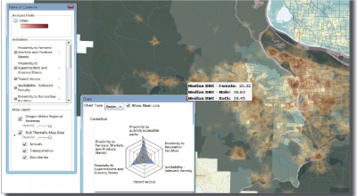
The Equity Atlas 2.0 includes more than a hundred indicators within 13 topic areas (community, democratic participation, demographics, economic opportunity, education, food, health care, health outcomes, healthy environment, housing, parks and natural areas, services and amenities, and transportation).
The maps cover a four-county region. Most of the data are mapped at a high level of spatial resolution (e.g. points, census block groups, census tracts, and neighborhoods).
Users can create customized maps from a menu of indicators that includes both heat maps (rasters) and shape maps (vectors and points). The tool enables users to layer different indicators on top of each other, create composite indicators, modify colors and symbology, add reference layers, zoom in to view specific areas in more detail, view underlying data for each geography, and generate a range of charts and graphs. The mapping tool also includes a gallery of pre-developed scenario maps that combine different layers together. The Equity Atlas’s accompanying website offers an overview of key findings, a gallery of maps and analysis, detailed metadata for all of the indicators, a user guide and video tutorials on each of the mapping tool’s features, guidelines for reading and understanding the maps, and other resources.
Denver Regional Equity Atlas
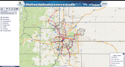 The Denver Regional Equity Atlas is the product of a partnership between Mile High Connects, Reconnecting America and the Piton Foundation. The equity atlas aims to visually represent the region’s opportunities and challenges in relation to transit. It enables users to create maps that depict the region’s major origins and destinations in relation to the current and future transit network, and to overlay this information with data on the region’s demographics, economic opportunities, and other factors.
The equity atlas includes 49 sets of data within seven indicator categories (demographics, housing, economic opportunity, education, health care, food, and recreation).
The maps cover a seven-county region. Much of the data can be mapped at a fairly high level of spatial resolution (e.g. census tracts, points, and block groups).
Users can create customized maps from a menu of indicators. The tool enables users to layer different indicators on top of one another, modify the reference layers, zoom in to view specific areas in more detail, view underlying data for each geography, and generate a range of charts and graphs. The tool also includes a gallery of pre-developed scenario maps. The accompanying website includes background information, metadata for the indicators, and video tutorials.