
| The interpretive website can be simple and streamlined, comprehensive and multifaceted, or somewhere in between. This page highlights a range of options, illustrated with examples from four very different equity atlas websites. |
 Option A: Basic
The basic interpretive website is simple and streamlined. It serves primarily as a platform for the equity atlas maps and provides brief background information on the project.
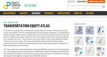
For example, the Pratt Center’s New York Transportation Equity Atlas website is a one-page site that provides links to a collection of downloadable PDF maps along with four short paragraphs of background information. The maps are displayed using thumbnail images. The page also includes an index that lists all of the maps by title.
Option B: Descriptive
A more descriptive approach that is still relatively simple to create is a multipage website that provides brief background, framing, and explanatory information, along with links to the equity atlas maps.
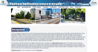 The Denver Regional Equity Atlas website is a good example of this approach. It has five pages, each with one to two paragraphs of information on background, topic areas, funding, audience, and contributors, as well as help and contact pages. The help page includes source data for the equity atlas indicators and how-to information on using the online mapping tool. The map page takes users directly to the equity atlas’s online mapping tool.
The original Denver Equity Atlas (2012), which is a book of static maps and text, offers a detailed analysis of the maps, but the online mapping tool and interpretive website do not include an analysis section.
 Option C: Comprehensive
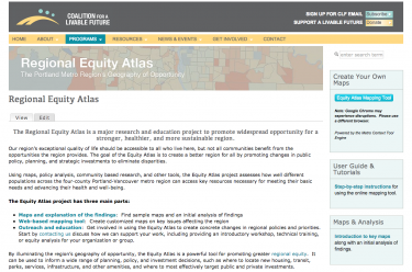
A more comprehensive approach is to create a multilayered website that includes detailed background and framing information, in-depth analysis of the maps and findings, supplemental information, how-to resources, and policy recommendations.CLF’s Regional Equity Atlas website illustrates this approach. It includes detailed background information on the project; a summary of key findings; an extensive gallery of maps organized by topic with an analysis of findings for each topic area; metadata for the indicators; user guides and tutorials for the online mapping tool; a link to the online mapping tool; photos and videos that tell stories of people’s experiences with inequity; white papers; information on workshops and trainings; and vignettes highlighting how the Regional Equity Atlas is being used to inform policy and planning.
 Option D: Advocacy Oriented
If the equity atlas project has an explicit advocacy agenda, the website can be organized around the project’s policy change platform. In this approach, the maps and interpretive information are embedded within the advocacy framework and are directly tied to policy change recommendations.
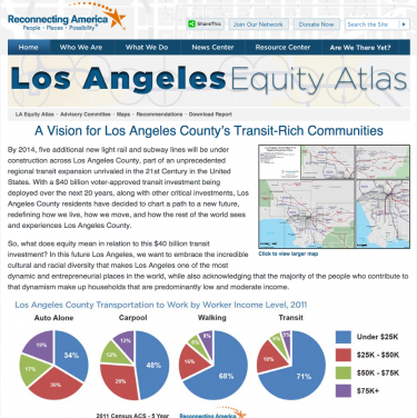
The Los Angeles Equity Atlas website illustrates this approach. It includes brief background information on the project followed by a comprehensive report organized by theme. Each theme is broken into six outcomes that form the framework for the report. The sections on each outcome include a vision statement, information on why the outcome is important, recommendations to achieve the outcome, and relevant maps and data highlighting current conditions in relation to the outcome. The report can be downloaded as a PDF or read as a navigable online document. The maps that support each outcome can be accessed via hyperlinks in each section of the report. An accordion menu on the website also provides an index of the maps that support each outcome.