|
|
|
|
|
Home ownership is a key source of asset building for many American households. Owning a home can also contribute to greater housing stability and an improved quality of life. But home ownership is beyond the reach of many lower-income households because of the substantial cash assets required in order to secure a home loan. The legacy of historic and institutionalized racial discrimination also contributes to racial disparities in access to mortgage lending. For these reasons, access to home loans is an important regional equity issue.
The maps in this series aim to shed light on some of the complex factors underlying the patterns of mortgage lending and home ownership in the region. The first set of maps looks at applications for Federal Housing Administration (FHA) insured loans and conventional loans. FHA loans aim to make home ownership more accessible for first-time homebuyers by requiring a lower minimum down payment compared with conventional loans. FHA loans require only 3 percent of the purchase price, while most conventional loans require at least 20 percent. For this reason, access to FHA loans can make home ownership more accessible to populations with limited cash assets.
The next set of maps looks at home loan denial rates for white and non-white applicants. Loans can be denied for a wide range of reasons, so these maps do not necessarily provide any direct insights into racial discrimination in lending. But they do offer an additional lens for analyzing potential patterns of racial disparities in access to home loans.
The final map in the series explores patterns in foreclosure rates. FHA loans offer one path to home ownership for lower income households. Over the past decade, sub-prime loans have offered another path. These loans typically have high interest rates, balloon payments, or adjustable rates. Regardless of the loan type, lower-income households often struggle to maintain their home loans because they typically spend a relatively high portion of their income on housing. Loss of employment, a health crisis, or other changes in household finances can make it impossible for households to meet their loan terms, leading to foreclosure. But foreclosure doesn’t just affect low-income households or those with sub-prime loans. The foreclosure crisis has also affected many higher income households. While this map does not enable us to disentangle all of these factors, it offers some interesting insights into foreclosure patterns in the region.

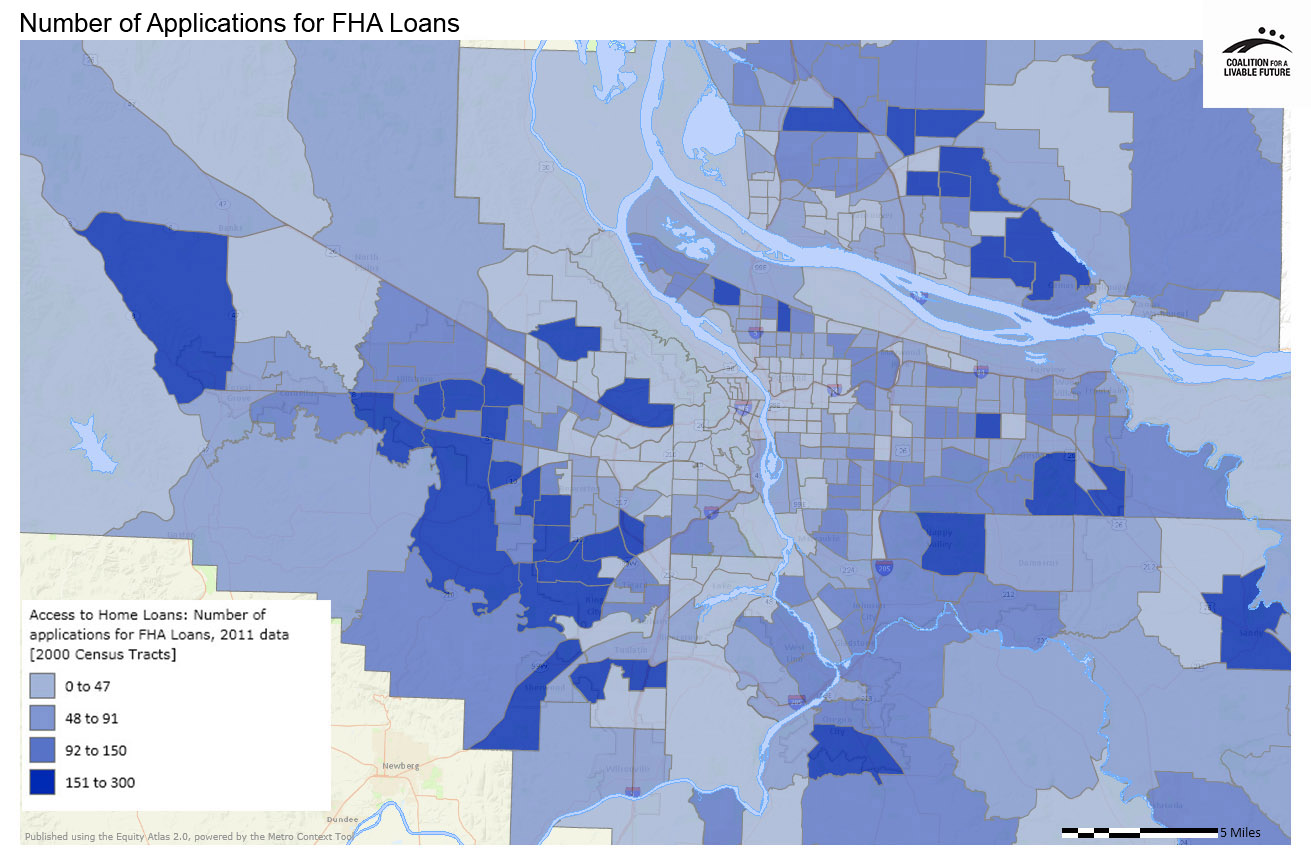
Analyzing access to home loans is complex, but the spatial distributions depicted in the Number of Applicants for FHA Loans and Number of Applicants for Conventional Loans maps are striking. If we compare the patterns to the Atlas’ income maps, we find that the applications for FHA loans tend to be concentrated in areas with lower median incomes, while the applications for conventional loans tend to be concentrated in areas with higher incomes. The census tracts with the highest numbers of applications for FHA loans are in a ring outside of the region’s urban core in census tracts located in and adjacent to cities such as Gresham, Sandy, Happy Valley, Oregon City, Camas, and portions of Vancouver, Hillsboro, Beaverton, Forest Grove, Sherwood, and Tualatin. The census tracts with the lowest numbers of FHA loans are in Portland’s northwest, southwest and inner east sides, Lake Oswego, and unincorporated areas of all four counties.
The census tracts with the highest number of applications for conventional loans are scattered across the region in parts of Happy Valley, Camas, Lake Oswego, a small slice of northwest Portland and the adjacent unincorporated area, and in portions of Sherwood, Tigard, Beaverton, and Hillsboro. The areas with the lowest numbers of conventional loan applications are also scattered across the region. In some places the highest rates of conventional loan applications are in areas with higher median home values and incomes, but this pattern does not hold true throughout the map. This is partially because the number of applications may be higher in places with high levels of housing development and/or high levels of turnover in ownership through foreclosure or other means (and therefore a high number of applications for loans in general) during the period covered by the data. This may explain why Happy Valley, for example, includes census tracts with the highest rates of both FHA and conventional loan applications.
The Home Loan Denials (White) and Home Loan Denials (non-White) maps are difficult to interpret because home loan applications can be denied for a wide range of reasons. The maps show definite patterns, but further analysis of additional data would be necessary in order to determine the reason for the patterns. The most noticeable pattern is that the number of census tracts with high rates of home loan denials for non-white applicants is greater than the number with high rates of home loan denials for white applicants. Furthermore, the map of denials to non-white applicants includes census tracts where 50-100% of applicants were denied, whereas the highest rate of denials to white applicants is 20.1-31%. However, it is also important to note that in some census tracts with high rates of denials, the total number of applications was quite small.
Looking at the geographic distribution of home loan denials, the rate of denials to white applicants appears to be relatively low in many of the region’s higher income areas. This includes many of Portland’s west and inner east side neighborhoods, and parts of Lake Oswego, West Linn, Wilsonville, Sherwood, Tigard, Beaverton, and Hillsboro. The highest rates of denial to white applicants tend to be in a few large census tracts on the periphery of the region as well as a few small census tracts located in areas closer to the urban core.
The rate of home loan denials to non-white applicants varies quite a bit from census tract to census tract across the region. Many cities have census tracts with low rates of denial located next to census tracts with high rates of denial. The areas with the most consistent low denial rates include census tracts in and adjacent to Sandy, Wilsonville, and unincorporated areas of Clackamas, Washington, and Clark counties.
The Foreclosures (Percent Notice of Transfer Sale) map shows the highest rates of foreclosures in zip codes located in a ring around the urban core. This includes zip codes in and adjacent to Hillsboro, Tigard, Oregon City, parts of north and outer east Portland, Gresham, and an area on the northeast edge of Vancouver. As with the home loan denial maps, there are many potential reasons why a home may go into foreclosure. Further analysis of the foreclosures in these hotspots would be necessary in order to fully understand these patterns.
This map shows the total number of FHA loan applications in 2011, mapped by 2000 census tract. FHA loans are only available to populations meeting the eligibility requirements, which disproportionately favor first-time homebuyers, those who can only afford a small down payment, and those with poor credit ratings.
These data were provided because of the HMDA (Home Mortgage Disclosure Act), which requires lending institutions to report public loan data. This map compiles data from the LAR reports (Loan Application Register), which record information on the type of loan application, race and ethnicity of applicants (using standard census race/ethnicity categories) and status of application loan (e.g. approved or denied). The data do not capture information on people who may not have applied for a loan to begin with because of economic or other barriers or the perception that they would be denied.
Data Source: Federal Financial Institutions Examinations Council HMDA Database (2011)
This map shows the total number of conventional loan applications in 2011, mapped by 2000 census tract. Conventional loans tend to require a higher amount of money for a down payment, adequate income levels to pay for the loan, and a minimum credit score.
Data Source: Federal Financial Institutions Examinations Council HMDA Database (2011)
This map shows the total number of home loan denials to non-white applicants in 2011, mapped by 2000 census tract for FHA, conventional, and other types of home loans. Loan denial information is based on Loan Application Register reports and does not provide adequate information on the reasons for the loan denial.
Data Source: Federal Financial Institutions Examinations Council HMDA Database (2011)
This map shows the total number of home loan denials to white applicants in 2011, mapped by 2000 census tract for FHA, conventional, and other types of home loans.
Data Source: Federal Financial Institutions Examinations Council HMDA Database (2011)
This map shows the percentage of households per zip code that received a Notice of Transfer Sale (NTS) as part of the foreclosure process. These data reflect fully foreclosed NTS properties, rather than REO (real estate owned by the lender) properties. This means that these figures exhibit lower percentages of foreclosure rates than other measures often used for foreclosures, because this map excludes properties that may have started the foreclosure process but were able to move out of foreclosure status.
Data Source: RealtyTrac (2011)