|
|
|
|
|
The quality of the air we breathe is largely determined by where we live and work. Air quality varies across the region, depending, at least in part, on proximity to sources of pollution such as roads, industrial facilities, and wood stoves. Air toxics such as diesel soot, benzene, polycyclic aromatic hydrocarbons, and metals like manganese and lead can cause serious health problems including cancer, nerve damage, and respiratory irritation. Exposure to poor air quality can also lead to chronic health conditions, such as asthma, and have a negative effect on overall quality of life. This makes air quality a significant regional equity issue.
The State of Oregon sets clean air goals by establishing benchmarks for many known air toxics. The benchmarks are based on concentrations of the toxics that individuals, including more vulnerable groups such as children or seniors, could breathe continuously over a lifetime without experiencing any non-cancer health effects or without increasing their risk above the general population’s cancer rate by greater than one chance in a million. The maps in this series measure variations in air quality across the region by showing how many times the levels of key toxics are estimated to be above the established benchmark rate.
The maps in the series include an analysis of air quality from all sources as well as a map that focuses just on road sources of toxics. The Atlas online mapping tool includes additional maps showing air quality from a range of other sources. The final map in the series layers the air quality map with the percentage of students eligible for free and reduced price lunch (as a proxy for poverty), along with the locations of freeways and arterial streets.

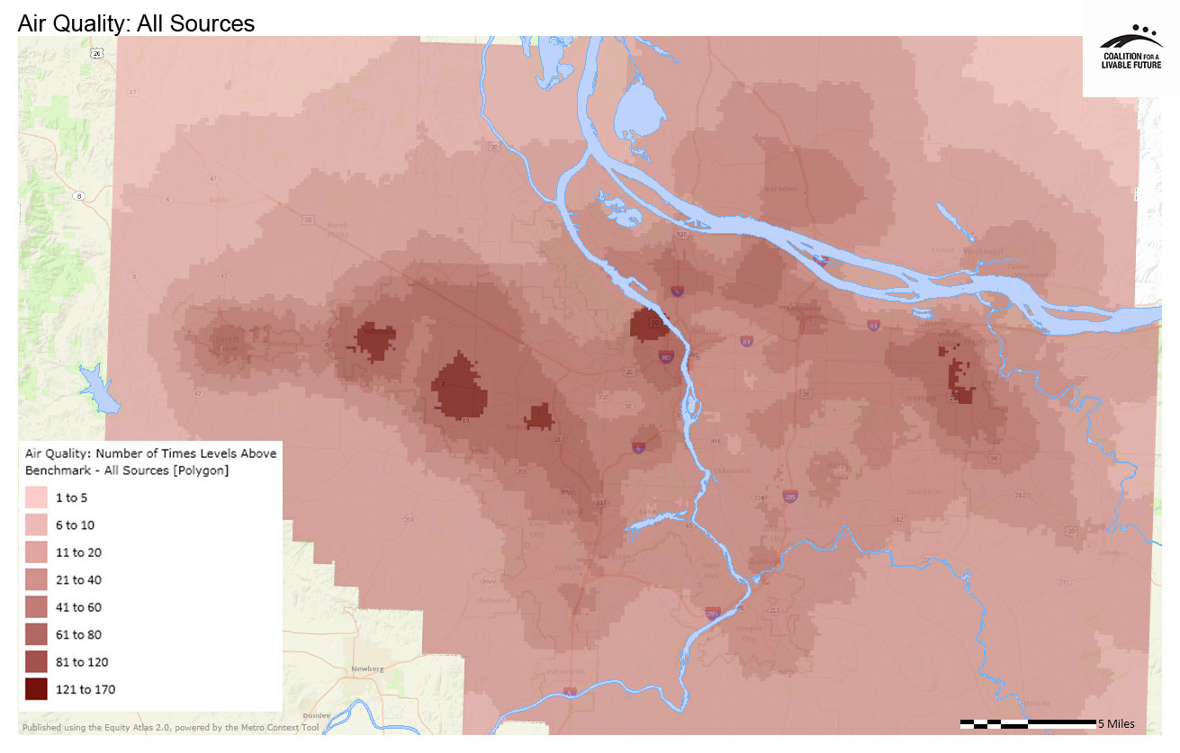
The Air Quality: All Sources map shows a number of hotspots in the region with extremely high levels of air toxics, at more than 120 times above the benchmark level. These hotspots are located in Hillsboro, Beaverton, Aloha-Cooper Mountain, Gresham, and Portland’s Northwest Industrial District.
There are much larger areas, often surrounding these hotspots, with air toxic levels that are 81 to 120 times above the benchmark. These areas include parts of Vancouver, Gresham, parts of northeast, northwest, and southwest Portland, part of Forest Grove, and a large area of Washington County between Tigard and Hillsboro.
While the map highlights these hotspots, it also indicates that almost the entire region has air toxics at levels that can cause adverse health effects. Some areas, particularly toward the periphery of the mapped area of the region, have levels that are only 1 to 5 times above the benchmark. But most of the region has levels at least 20 times above the benchmark, with higher concentrations found in densely populated neighborhoods, near busy roadways, and in areas with higher levels of business and industrial activity.
The patterns in the Air Quality: Road Sources map are somewhat predictable, with the highest concentrations of air toxics in areas along the region’s major freeways. What is interesting about the map is that the highest concentrations of air toxics are not evenly distributed along the freeways. Some neighborhoods are impacted more than others, and the sizes of the impacted areas vary.
The two hotspots with the highest concentrations of air toxics from road sources, at 41 to 60 times above benchmark level, are located in and adjacent to downtown Portland and in an area south of US-26 in Hillsboro. The hotspots with air toxics at 21 to 40 times above benchmark level are much larger. They include areas along I-205 in Vancouver, northeast Portland, and adjacent to Happy Valley; areas along I-84 in Portland and Gresham; inside and around the I-405 loop in Portland; along I-5 from north Portland to Wilsonville; and along US-26 from Beaverton to Hillsboro.
The Air Quality in Relationship to Percent Students Eligible for Free or Reduced Price Lunch, Freeways and Arterial Streets map shows how the Air Quality: All Sources map relates to school poverty levels and to the locations of major roadways. It shows a clear relationship between the locations of major freeways and the areas with higher levels of air toxics – a connection that is not surprising given the patterns in the Air Quality: Road Sources map. However, the locations of air toxics are not limited to the areas near freeways, indicating that while road sources are certainly an important contributor to overall air toxics levels, they are not the only contributor. The Atlas online mapping tool includes additional maps showing air toxics levels from other sources including residential wood burning, area sources (e.g. residential wood combustion and solvent use), and point sources (e.g. industrial emissions). These maps help to provide additional insights into the complex factors that influence overall air toxics levels.
Overlaying the region’s schools on top of the air quality map reveals several interesting patterns. First, the areas with the greatest densities of schools tend to also be the areas with higher air toxics levels. This suggests that air quality tends to be poorer in the more populated areas of the region. Second, if we focus on the schools’ free and reduced price lunch eligibility levels, we see many places where higher poverty schools (those with the largest pink circles) are located in areas with high air toxics levels. But there are also a number of areas where this pattern does not hold true. For example, the air toxics hotspot located in and adjacent to Portland’s Northwest Industrial District is surrounded by very low poverty schools. Conversely, there are some high poverty schools in outlying parts of Clackamas County that are in areas with relatively low air toxics levels.
The maps in this series suggest that exposure to air toxics is a significant problem in the Portland metro region, and it is a problem that does not affect all of the region’s residents equally. While additional research is needed to fully understand the disparate impacts of air toxics exposure, the need to address these disparities is clear.
The Portland Air Toxics Solutions project, which provided the data for these maps, used the data to conduct an environmental justice analysis of air toxics impacts. A summary of the analysis is available at http://www.deq.state.or.us/aq/planning/report/8environmentalJustice.pdf. The analysis demonstrates that populations of color and low-income populations experience disproportionate impacts from air toxics in the Portland metro region. This analysis, as well as additional research on disparities in air toxics exposure, can help to inform strategies to increase regional equity by ensuring that everyone in the region has access to clean air.
This map shows proximity to sources of air pollution and concentrations of air toxins, based on indicators developed by the Oregon Department of Environmental Quality's Portland Air Toxics Solutions Project. The study uses both modeling of future emissions and current monitoring to ascertain where air toxics concentrations are likely to exceed safety benchmarks in 2017. Sources include road sources, non-road sources, residential wood stoves, point sources and area sources.
Data Source: Oregon Department of Environmental Quality modeling for 2017
This map shows proximity to sources of air pollution and concentrations of air toxins, based on indicators developed by the Oregon Department of Environmental Quality's Portland Air Toxics Solutions Project. This is the same study used for the Air Quality: All Sources map, but includes only road sources in the mapped data.
Data Source: Oregon Department of Environmental Quality modeling for 2017
This map layers the Percent Students Eligible for Free or Reduced Price Lunch point layer on top of the Air Quality: All Sources map, also highlighting freeways and arterial streets.
Data Source: Oregon Department of Environmental Quality modeling for 2017; Oregon Department of Education & Washington Office of the Superintendent of Public Instruction (2011-2012); Metro RLIS (2012)