Housing Affordability
Access to affordable housing is a fundamental building block for a successful life. The geographic distribution of affordable housing has a direct effect on residents’ ability to access all of the resources and opportunities that are essential for meeting basic needs and achieving health and well being. For these reasons, understanding the “geography of opportunity” related to housing is essential to any analysis of equity issues in the region.
This map series looks at housing affordability from several angles. It includes maps on (a) median home value, (b) change in median home value, (c) median rental cost, (d) housing purchasing power, (e) the housing plus transportation cost burden, and (f) the location of publicly subsidized affordable housing in relationship to areas with above the regional average percentage of populations in poverty.
What the Maps Tell Us: Initial Findings
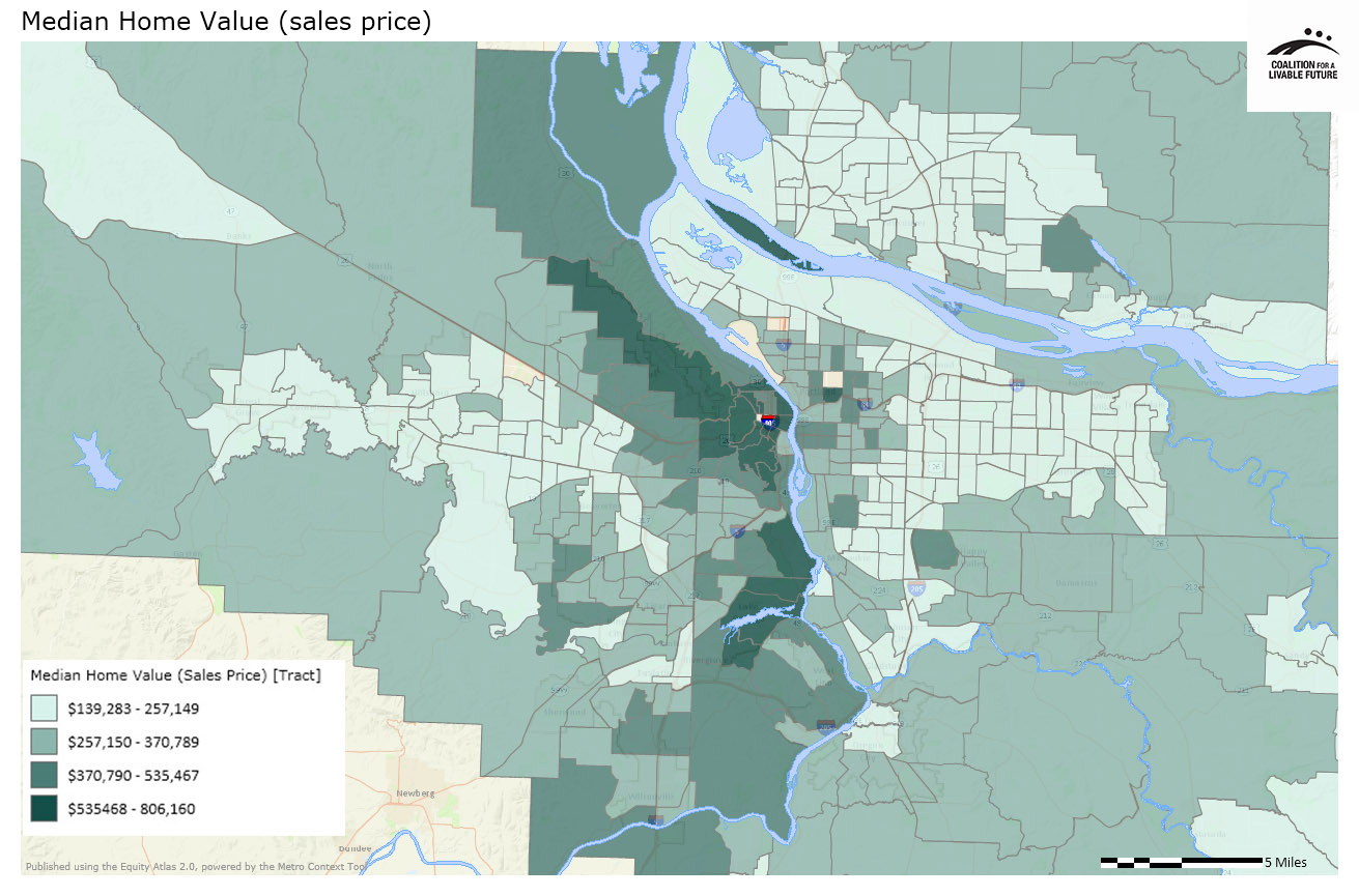
The first two maps in this series provide information about owner occupied housing: Median Home Value and Change in Median Home Value (2000-2010). The census tracts with the highest median housing prices are in the west hills, Lake Oswego, Irvington and Hayden Island. The median sales prices in 2010-11 ranged from approximately $535,500 to $806,000 in these areas. The census tracts with the lowest median housing prices include portions of north Portland, outer east Portland, east Multnomah County, and portions of Oregon City, Canby, Tualatin, Beaverton, Hillsboro, Forest Grove and Vancouver, as well as the city of Cornelius. Median sales prices in 2010-11 ranged from approximately $140,000 to $257,000 in these areas.
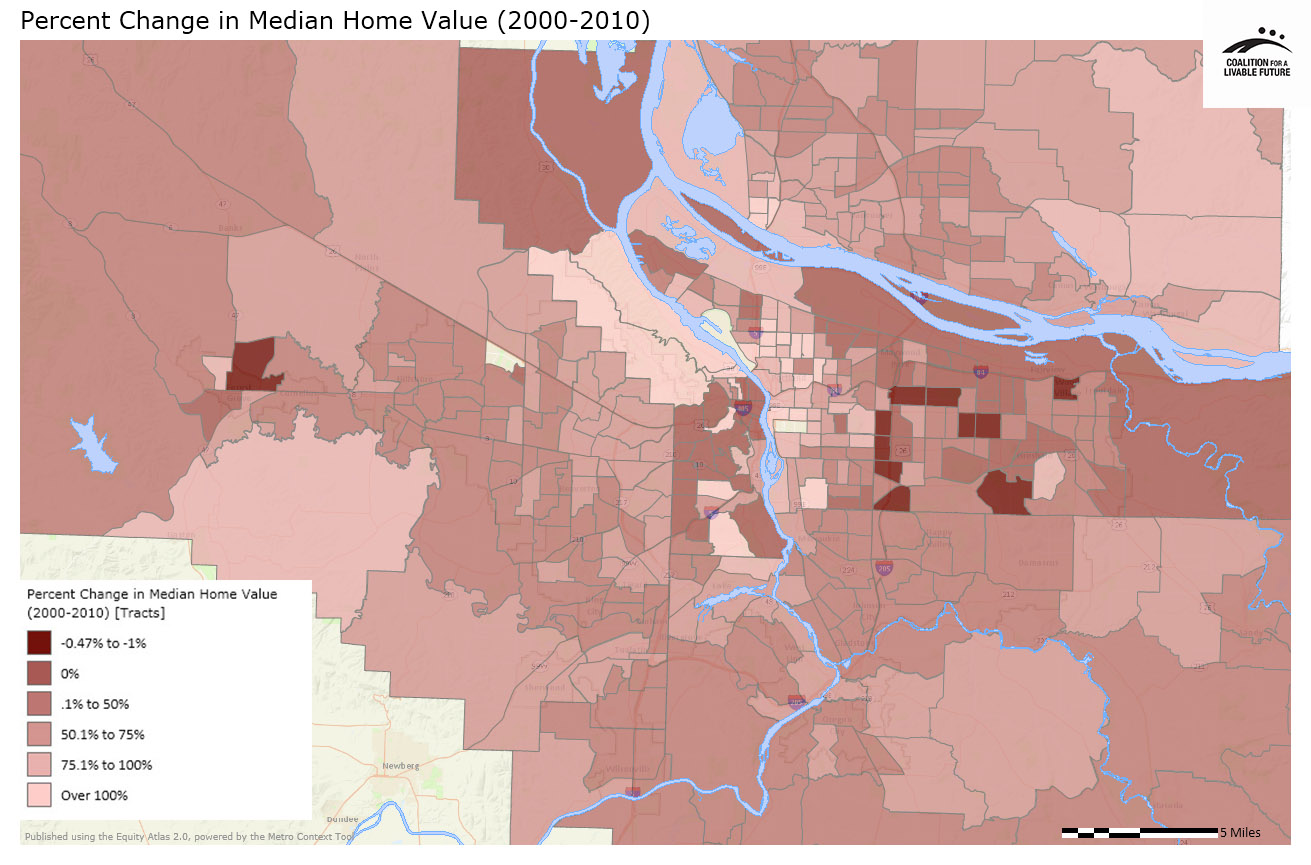
Nearly all the census tracts where the median housing sales price more than doubled from 2000 to 2010 are located in the cities of Portland and Vancouver. These areas include the Vancouver neighborhoods of Esther Short, Hough and Arnada. In Portland, these areas include neighborhoods in inner northeast and southeast, the southwest neighborhoods of Markham, Arnold Creek, Marshall Park and Southwest Hills, and the northwest neighborhoods of Forest Park and Linnton.
Census tracts where the median inflation-adjust housing sales price was lower in 2010 than in 2000 include a few neighborhoods in outer east Portland and east Multnomah County and a census tract that includes portions of Forest Grove and adjacent unincorporated Washington County.
These data do not fully capture the volatility of housing prices over the past decade. Prices rose rapidly in the early part of the decade and then dropped toward the latter part of the decade. Prices are now beginning to gradually increase again. The Change in Median Home Value map compares sales price data on homes sold in the year 2000 and 2010, so it reflects two snapshots in time rather than the trends over the course of the entire decade.
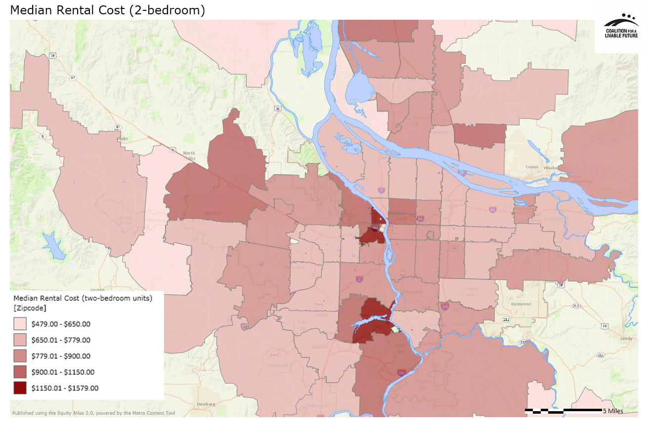
The Median Rental Cost map provides data on rental housing; unfortunately these data are only available by zip code, so the map does not provide as nuanced an analysis as the other maps in this series. It is also important to note that the data used for this map are taken from a relatively small sample of units, and the units included may or may not be representative of the full range of rental housing in the region.
The zip codes with the highest rents in the region include Lake Oswego, downtown Portland and the adjacent Southwest Hills, Pearl and Old Town neighborhoods. Median monthly rents ranged from $1,150 to $1,580 in these areas in 2011 for a two-bedroom unit. The inclusion of Lake Oswego, the Southwest Hills, and the Pearl District among the region’s highest rent neighborhoods is not too surprising. The inclusion of downtown Portland and Old Town is more surprising, since the region’s highest poverty census tract overlaps with both of these neighborhoods.
The zip codes with the lowest rents include portions of Estacada, unincorporated Clackamas County, Cornelius, unincorporated Washington County, Vancouver, Battleground, and unincorporated Clark County. Median monthly rents ranged from $479 to $650 for a two-bedroom unit in these areas in 2011.
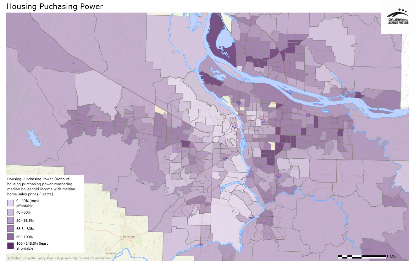
The Housing Purchasing Power map indicates whether or not the average household living in a particular census tract would be able to afford an average home for sale in that census tract at current day sales prices. In Clark County, the least affordable census tracts (the places where current residents are least likely to be able to afford to purchase an existing home) include an area comprised of the Fruit Valley and West Hazel Dell neighborhoods and the unincorporated area immediately to the north, and census tracts along State Road 500 between I-5 and I-205. Portland’s least affordable census tracts include those in the St. Johns neighborhood in north Portland and the Lents, Brentwood/Darlington, Southgate, Powellhurst/Gilbert, Montavilla, Centennial and Sumner neighborhoods in outer east Portland. Other least affordable census tracts around the region include those in Central Beaverton and the North Gresham, Rockwood and Northeast neighborhoods in Gresham.
There are several potential reasons why an area would not be affordable to current residents. This divergence might be explained by housing values rising more rapidly than the residents’ incomes (raising potential future gentrification concerns), by the fact that a large share of households are renters who are unable to afford to purchase homes, by an influx of lower-income households into a historically moderate income neighborhood (raising potential concerns of disinvestment), or by other factors. Looking at this map in conjunction with some of the other Atlas maps may provide additional insights into the mismatch between housing values and the purchasing power of existing residents in these areas.
For many years, housing has been considered to be affordable if it costs no more than 28% to 35% of household income. More recently, analysts have begun to consider the affordability of housing and transportation costs jointly because housing and transportation are usually a household’s two largest expenses, and households often make tradeoffs between the two. For example, a household may choose to live in a more expensive apartment because it is more convenient to destinations that they frequent regularly, such as work. Other households may choose to live in a less expensive housing location but pay more for transportation costs because the home is farther away from frequent destinations.
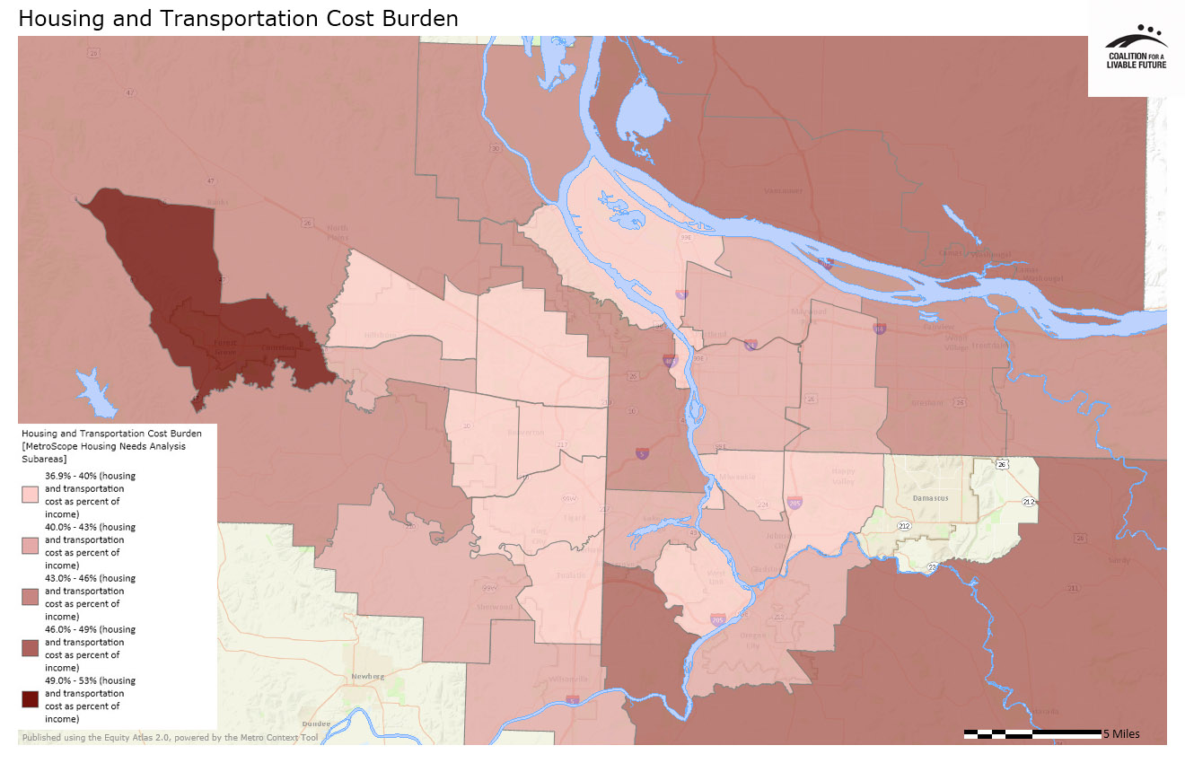
The map Housing and Transportation Cost Burden utilizes a complex modeling algorithm to determine the combined housing and transportation costs relative to household income in each part of the region. The data are mapped by Metro Housing Needs Analysis Subareas, which are aggregations of census tracts. The map shows what residents in each subarea pay for housing and transportation relative to the median income for that area. In this analysis, a household is considered cost-burdened if it spends more than 45% to 55% of its income on housing and transportation costs (45% for a low income household).
The map shows that the highest combined housing and transportation cost burden in the region is found in an area that includes Forest Grove, Cornelius and the surrounding unincorporated area of west Washington County. The combined cost for housing and transportation is 52.2% of that area’s median income, which is considered unaffordable. The area with the least cost burdened residents is located around Happy Valley, where combined housing and transportation costs represent 37.4% of that area’s median income. However, given the diversity of incomes and housing costs in that area, this average figure may mask the experiences of the area’s lowest income residents who may bear a much higher combined housing and transportation cost burden than their wealthier neighbors.
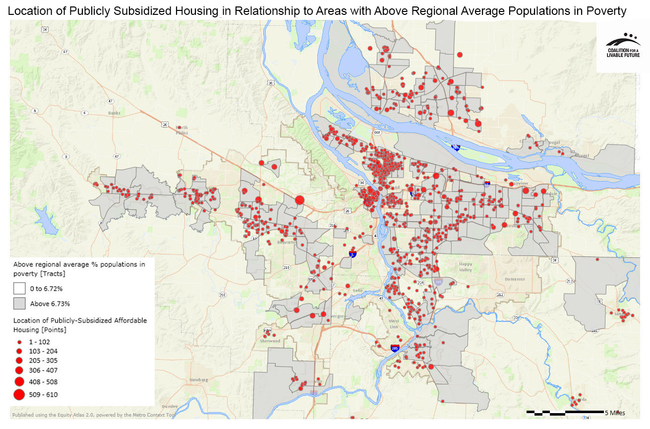
The map Location of Publicly Subsidized Affordable Housing in Relationship to Areas with Above Regional Average Percent Populations in Poverty depicts the locations of housing units that have received public funding in order to maintain rents that are affordable to households that cannot afford market rents. The map shows that nearly all of the region’s publicly subsidized housing units are located in areas where the poverty rate is above the regional average of 6.72%. This suggests a general alignment between the locations of affordable housing units and the people who are in need of that housing. But it also suggests that many affordable housing units may be located in areas of lower opportunity, since high poverty neighborhoods frequently have reduced access to opportunity. It is important to note that this map does not include information about where people live who use subsidized housing vouchers to help pay for market rate housing units.
Housing affordability plays a central role in equity issues related to access to opportunity. Where people live has an effect on their day-do-day lives, their access to jobs, quality education, and a healthy environment, and their social networks. Housing patterns that separate low income households or people of color from access to opportunity pose major equity issues. Housing affordability—the share of income that people pay for household costs—also affects the degree to which residents have sufficient resources to take care of life’s other necessities. The maps in this series help set the stage for further equity discussions of the region’s housing, transportation and land use policies.
About the Maps
Median Home Value
This map shows the median home value by census tract based on the recorded sales prices of owner-occupied single family homes on less than 10 acres.
Data Source: Tax assessor data on homes sold during the measurement year, from Metro RLIS (2011) and Clark County GIS (2010)
Change in Median Home Value (2000-2010)
This map shows the percent change in sales prices between 2000 and 2010. The average home values (by census tract) are based on the recorded sales prices of owner-occupied single family homes on less than 10 acres in 2000 and in 2010. The value is calculated by taking the difference between the average home values in 2010 and 2000 (adjusted for inflation) then dividing the difference by the average 2000 home value.
Data Source: Tax assessor data on homes sold in 2000 and 2010, from Metro RLIS and Clark County GIS
Median Rental Cost
This map shows data on average rental costs for two-bedroom units by zip code. The data are based on a Metro Multifamily Housing Association Apartment Survey that gathered information about rental rates in 2011. The data come from the 1,072 properties that responded to the survey; it is unknown whether the median rental costs based on the sample are an accurate reflection of median rental costs for all rental units in each zip code.
Data Source: Survey data gathered 02-07-12 through 03-15-12 (reflecting 2011 average rents) by the Metro Multifamily Housing Association Apartment Survey
Housing Purchasing Power
This map shows the ratio of estimated housing purchasing power to housing costs by census tract. It is calculated by comparing the census tract’s median household income to the median price of single-family homes in each census tract. "Housing purchasing power" is based on the 2010 median housing income and the contemporary lending climate (2011/2012). Low percentages indicate places where current residents could potentially afford to purchase a home for sale in their area, if they were in the market to do so (low divergence between housing costs and housing purchasing power); high percentages indicate places where current residents are less likely to be able to afford to purchase an existing homes in their area (high divergence between housing costs and housing purchasing power).
Data Source: Portland Metro and Clark County GIS (tax assessor’s database) 2012; 2000 U.S. Census and 2010 American Community Survey
Housing and Transportation Cost Burden
This map shows average housing and transportation costs as a percent of annual household income, mapped by Metro Housing Needs Analysis Subareas, which are aggregations of census tracts. The data include all annual housing costs such as mortgages, property taxes, maintenance, rents, utilities, household operations, supplies and appliances/furnishing. Transportation costs include all annual transportation costs (including public transit costs). Households are defined as "cost burdened" if they are spending more than 45-55% of their income on housing and transportation costs (the specific percentage varies based on income level).
Data Source: MetroScope Housing Needs Analysis, which uses American Community Survey data, Bureau of Labor Statistics Consumer Expenditure Survey data and other data sources to model average housing and transportation costs as a percent of annual household income. Census tract level estimates of dwelling units by single family and multi-family are from 2005. Demographic (income, age, household size) and housing data (housing type by value class) are taken from the 2000 Census. Updating to 2005 and matching demographics to housing by value class are computed within MetroScope
Location of Publicly Subsidized Affordable Housing in Relationship to Areas with Above Regional Average Percent Populations in Poverty
This map shows the census tracts with above regional average percent populations in poverty overlaid with the location of housing units that are made affordable through public subsidies and/or agreements or statutory regulations that restrict or limit resident income levels and/or rents. Publicly-subsidized (also referred to as "regulated") affordable housing generally provides housing for households that otherwise could not afford adequate housing at market rates. The map does not include non-regulated (i.e. private market) housing units that provide housing that is affordable to low-income residents. The data also do not include the locations of households using publicly subsidized vouchers rent private market housing units.
Data Source: Metro's 2011 Regional Inventory of Regulated Affordable Housing; American Community Survey 5-Year Estimates 2006-2010
|
This document was downloaded from the Map Series library of the Coalition for a Livable Future’s Regional Equity Atlas 2.0 website. The Regional Equity Atlas is a research and education project to promote widespread opportunity for a stronger, healthier, and more sustainable Portland-Vancouver metropolitan region. For more information, visit www.equityatlas.org. |
