Cardiovascular Disease
Cardiovascular disease — a category of diseases affecting the heart and blood vessels, including heart disease and stroke — causes more deaths in Americans than any other disease and is also one of the leading causes of disability in the United States. National research indicates that low-income populations and populations of color bear a disproportionate burden of both death and disability from cardiovascular disease, and it is a major contributor to differences in life expectancy among racial and ethnic groups. Cardiovascular disease is also significantly impacted by lifestyle and behavior choices -- such as rates of physical activity and healthy eating -- that are shaped by the built and natural environment.
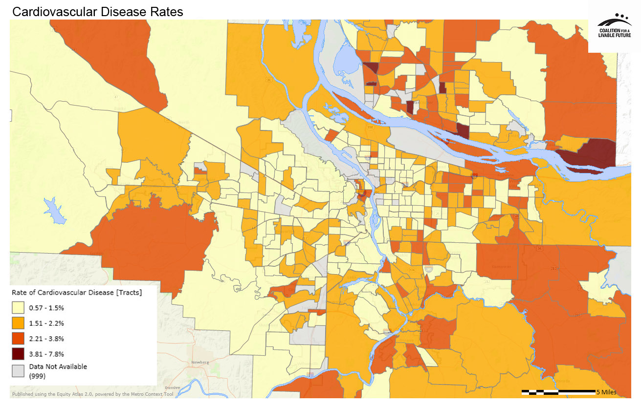
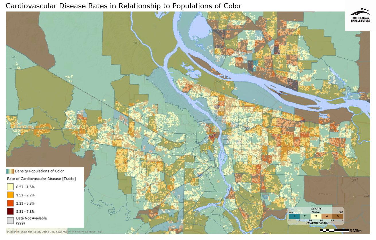
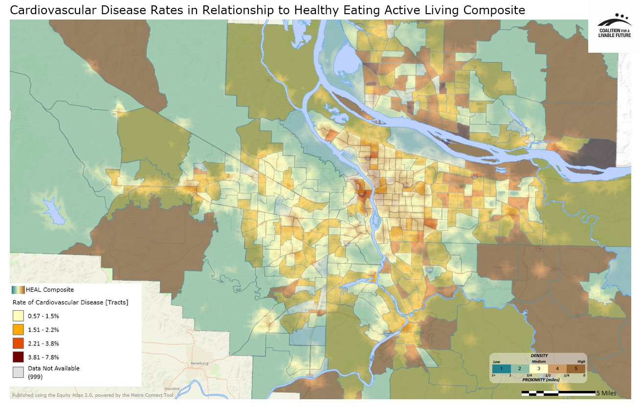
This map series examines cardiovascular disease rates for the region and how these rates compare with demographic patterns. It also explores the relationship between cardiovascular disease rates and factors in the built and natural environment that affect healthy eating and active living. It includes maps of (a) cardiovascular disease rates by census tract; (b) cardiovascular disease rates in relationship to the geographic distribution of populations of color; and (c) cardiovascular disease rates in relationship to the healthy eating active living composite map.


What the Maps Tell Us: Initial Findings
Note: Although the Cardiovascular Disease Rates map includes data for some Clark County census tracts, these data should be interpreted with caution. The map is based on data submitted to the Oregon Health Care Quality Corporation, which collects insurance claims data for health plans operating in Oregon. Some of the participating health plans submit claims data for members living in Clark County, but many do not. For this reason, the Clark County data are based on a limited population of Clark County residents and may not be representative of the entire population. The analysis of the maps in this series will therefore focus only on the portions of the region located in Oregon.
The Cardiovascular Disease Rates map is characterized by a fairly consistent pattern in which cardiovascular disease rates tend to be lowest in census tracts in the geographic center of the region, both in and to the immediate west and south of Portland. The census tracts with the lowest cardiovascular disease rates (0.57%-1.5%) are concentrated in Portland’s inner east and west sides, unincorporated areas of Washington County, parts of Lake Oswego, West Linn, Happy Valley, and Damascus. There are also quite a few census tracts throughout Beaverton, Hillsboro, Aloha, and other nearby unincorporated areas that have low rates of cardiovascular disease, but these census tracts are interspersed with census tracts with higher rates (1.51%-2.2%).
The Cardiovascular Disease Rates in Relationship to Healthy Eating Active Living Composite map shows how access to walkable neighborhoods, transit, parks, healthy food, and recreation (collectively referred to as “HEAL”) compares with cardiovascular disease rates. (For more information on the Healthy Eating Active Living Composite map and the HEAL concept, see the Healthy Eating Active Living map series.) The patterns in the map are striking. The areas at the center of the region with the highest access to factors that promote healthy eating and active living also tend to have the lowest rates of cardiovascular disease. Conversely, some of the census tracts with the highest rates of cardiovascular disease are located in outlying areas with very low levels of access to factors that promote healthy eating and active living.
There are also some notable exceptions to this general pattern. For example, downtown Portland, which has one of the highest HEAL rates in the region, has cardiovascular disease rates at the second highest level (2.21%-3.8%). Conversely, there are several large census tracts in unincorporated parts of Washington and Clackamas counties with low cardiovascular disease rates and very low HEAL scores. These exceptions suggest that while access to factors that promote healthy living and active living may influence cardiovascular disease rates, other variables also play a role.
The Cardiovascular Disease Rates in Relationship to Populations of Color map suggests a potentially significant relationship between race and cardiovascular disease. The areas on the map with the highest densities of populations of color (the darker brown clusters on the map) also tend to be the areas with cardiovascular disease rates that are above the lowest level (the yellow and orange areas on the map). This is not uniformly the case, but the pattern is nonetheless fairly consistent, suggesting that populations of color across our region may be disproportionately affected by cardiovascular disease.
The patterns in this map series raise important questions about health disparities, the reasons for these health disparities, and how we as a community should address these disparities. The Atlas maps highlight patterns, but the maps themselves cannot explain the reasons for these patterns. Additional research will be needed to more fully understand the patterns in the maps in order to develop potential solutions.
About the Maps
Cardiovascular Disease Rates
This map is based on data provided by the Oregon Health Care Quality Corporation. It depicts participating insurance plan members, ages 18-75, who were identified as having a cardiovascular condition. These data include administrative claims (billing) data from eight commercial health plans, two Medicaid managed care plans and the Oregon Health Authority Division of Medical Assistance Programs (Medicaid). The data for this indicator come from health insurance claims records, so they do not include data on uninsured patients, patients who pay for their own health care services, Medicare fee-for-service patients, or patients served by a plan or Medicaid provider that does not supply data to the Oregon Health Care Quality Corporation. The data, therefore, do not represent all persons living within a census tract. The data were first geocoded by patient address and then aggregated into census tracts in order to maintain confidentiality.
Data Source: Oregon Health Care Quality Corporation (2011)
Cardiovascular Disease Rates in Relationship to Populations of Color
This map layers the Populations of Color (Density by Acre) map with the Cardiovascular Disease Rates map.
Data Source: U.S. Census (2010); Oregon Health Care Quality Corporation (2011)
Cardiovascular Disease Rates in Relationship to Healthy Eating Active Living Composite
This map layers the Healthy Eating Active Living (HEAL) Composite map with the Cardiovascular Disease Rates map.
Data Source: Oregon Health Care Quality Corporation (2011); Metro RLIS (2012); Clark County GIS (2012); U.S. Department of Agriculture (2012); Portland Farmers' Market (2012); Oregon Environmental Council (2012); ESRI Business Analyst (2010)
|
This document was downloaded from the Map Series library of the Coalition for a Livable Future’s Regional Equity Atlas 2.0 website. The Regional Equity Atlas is a research and education project to promote widespread opportunity for a stronger, healthier, and more sustainable Portland-Vancouver metropolitan region. For more information, visit www.equityatlas.org. |
