Populations of Color
In an equitable region, everyone in the region benefits from the opportunities the region provides. As our region becomes more racially and ethnically diverse, our shared prosperity depends on our ability to create conditions that will allow people of all races and ethnicities to flourish.
This map series plays an important role in our analysis of regional equity conditions by examining the geographic distribution of populations of color across the region and how those distributions have changed over the past decade. The maps demonstrate the increasing racial and ethnic diversity of our region, and they also provide essential context for the other Atlas maps. In order to understand the disparities in our region, it is not enough to simply look at the geographic distribution of resources and opportunities. We must also understand how those distribution patterns impact the people in the region, particularly the region’s most disenfranchised populations. Comparing the populations of color maps with the Atlas’ resource maps highlights the region’s patterns of inequity and can help to inform strategies to address disparities.
The maps in this series show (a) where populations of color live, based on 2010 Census data, (b) the percent change in populations of color between the 2000 and 2010 Census, (c) the census tracts with above regional average percent populations of color, and (d) how the distribution of populations of color compares with the distribution of poverty across the region.


What the Maps Tell Us: Initial Findings
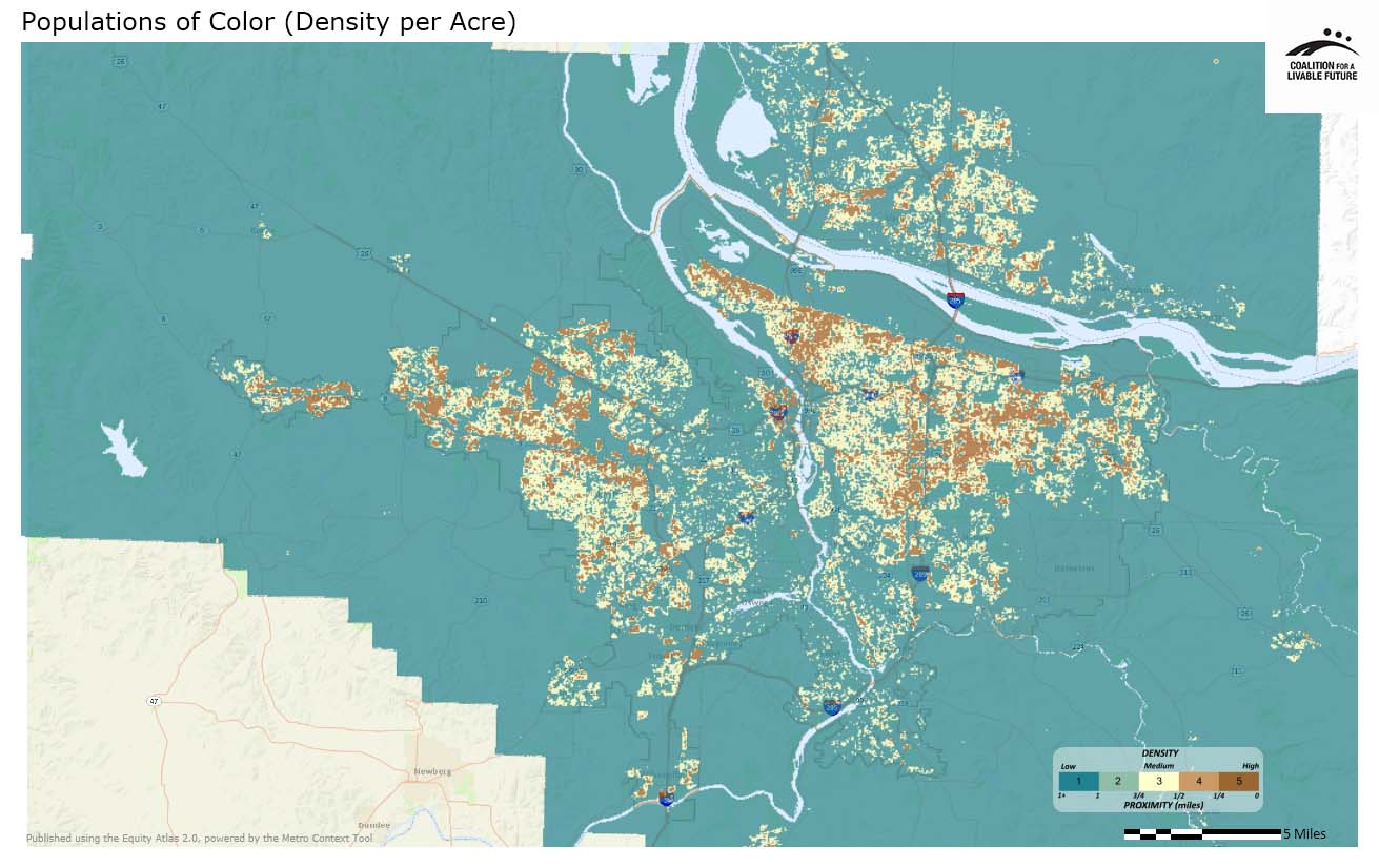
The map Populations of Color (Density by Acre) shows that people of color live throughout the region. In Portland, areas with particularly high densities of populations of color are located in parts of downtown, the Pearl, the northwest district, north Portland, inner northeast Portland, outer east Portland, the Cully neighborhood, and along a strip immediately west of I-205. In east Multnomah County, areas with high densities of populations of color can be found in the cities of Gresham, Wood Village, Fairview and Troutdale. Significant densities of populations of color are also located along the Tualatin Valley Highway in Washington County and span the inner rim cities of Beaverton and Hillsboro, as well as the satellite cities of Cornelius and Forest Grove. High densities are also located near Allen Boulevard in Beaverton and along 99W in Tigard. In Clackamas County, high densities of populations of color are located in Milwaukie, Wilsonville, Canby and at the intersection of I-205 and I-5 in Tualatin. High density areas also follow a few major transportation routes in Clark County, including Mill Plain Boulevard and State Road 500. Clark County neighborhoods with the highest densities of populations of color include Bagley Downs, Harney Heights, and Fourth Plain Village.
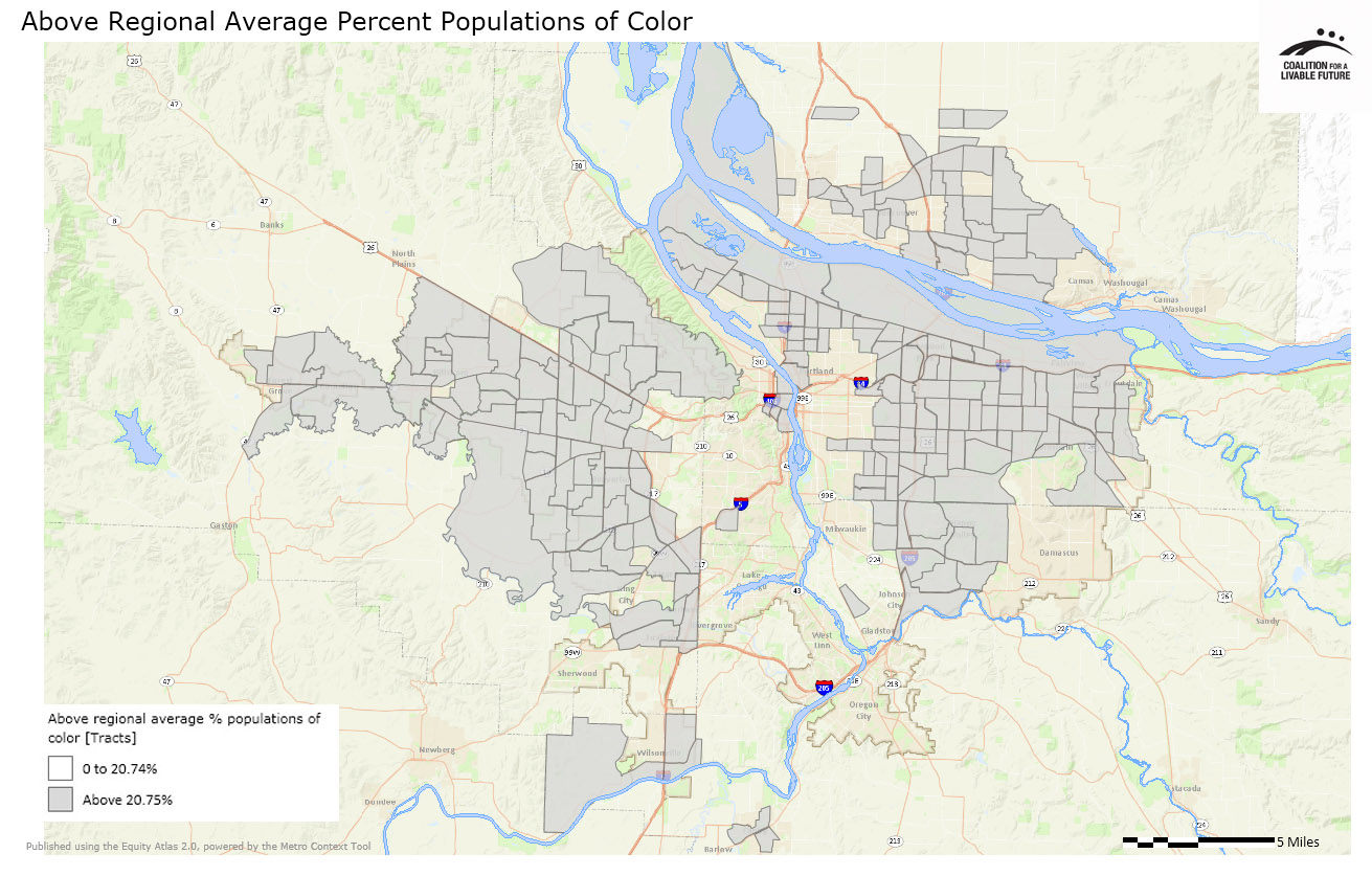
The Above Regional Average Percent Populations of Color map shows the census tracts in which the percentage of residents who are people of color is higher than the regional average of 20.4%. The pattern looks like a donut with a piece missing; areas with higher than average populations of color form the donut, while the Portland west hills and inner northeast Portland form the donut hole, and the areas around and including Lake Oswego and West Linn to the south form the piece of the donut that is missing. The percentage of residents who are people of color in these areas is lower than the regional average.
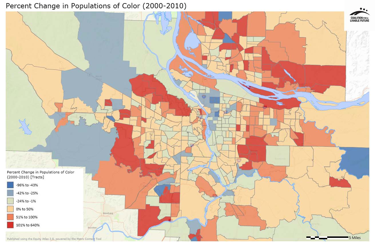
The Percent Change in Populations of Color (2000-2010) map indicates that the spatial distribution of populations of color across the region shifted fairly dramatically over the past decade at the same time as the region was becoming more racially and ethnically diverse. From 2000 to 2010, the percentage of residents who were people of color decreased in inner northeast and southeast Portland census tracts, with the largest decreases occurring in the inner northeast. Several census tracts in far western unincorporated Washington County and far eastern Clackamas County, beyond the Urban Growth Boundary, also show decreases in the percentage of populations of color. Increases occurred in inner suburban cities such as Gresham and Happy Valley, outer east Portland and in nearly all of Clark County.
This population shift over the last decade is consistent with the narrative of rising property values and displacement in inner Portland neighborhoods and select rural areas, and increasing racial and ethnic diversity in many inner suburban communities. It is also consistent with the patterns highlighted in the original Equity Atlas’ analysis of the demographic changes in the region between 1990 and 2000. From an equity standpoint, it helps document the negative consequences of intensive investments in inner Portland neighborhoods during the last decade and raises questions about how and where public investments might be made in the future.
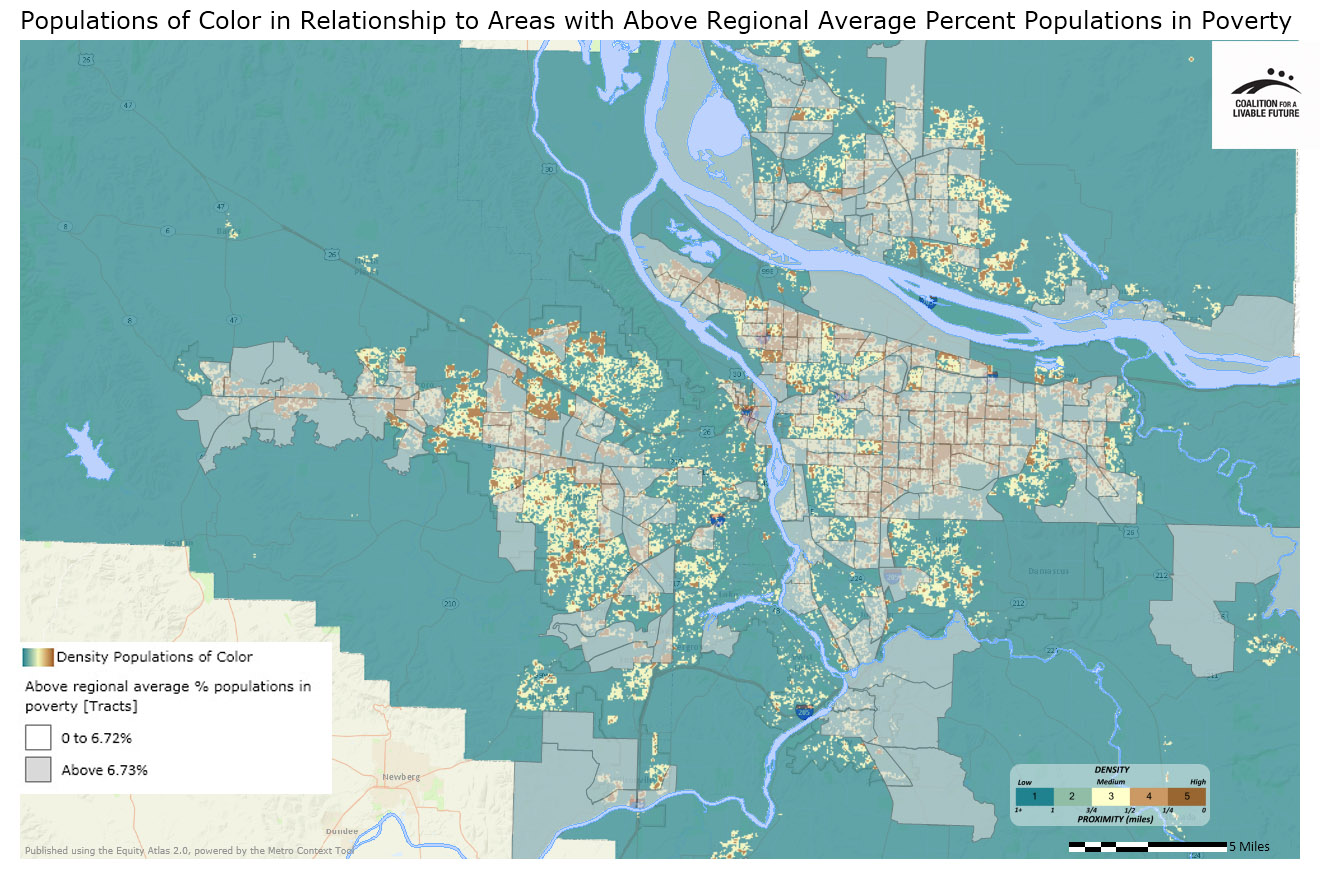
The map Populations of Color in Relationship to Areas with Above Regional Average Percent Populations in Poverty shows that most places with high concentrations of people of color also have poverty rates higher than the regional average of 6.72%. The exceptions—places with high concentrations of people of color with poverty rates lower than the regional average—are primarily located in Washington County, and include areas in Beaverton, Hillsboro, Tigard and unincorporated Washington County. This may be, in part, because of the relatively high density of Asians, particularly those employed in the high technology sector, who live close to the region’s Silicon Forest in Beaverton, Hillsboro, and unincorporated areas of Washington County.
From an equity perspective, the overlap between places with high concentrations of populations of color and places with higher than average poverty rates is an important finding. First, it indicates that populations of color are disproportionately likely to be low income – a pattern that is borne out by regional demographic data. Second, it suggests that populations of color are more likely to live in neighborhoods with inadequate access to the resources necessary for meeting their basic needs and advancing their health and well-being. This map, in combination with other Atlas maps showing the geographic distribution of resources and opportunities, can help to inform a broader analysis of regional equity and shape strategies to address disparities through targeted investments and changes in policy and planning.
About the Maps
Populations of Color (Density by Acre)
This map shows the density by acre of populations of color based on 2010 Census data. Populations of color are defined as all persons except those identifying themselves as white, non-Hispanic. It includes persons identifying their race or ethnicity (alone or in combination) as Hispanic, African American, Asian, Native American/Alaskan Native, and Native Hawaiian/Pacific Islander.
The categories used in the Census for collecting information on race and ethnicity do not capture the wide range of racial and ethnic identities within the population. Requiring respondents to define themselves using these categories renders some populations invisible. Furthermore, people of color have historically been under-counted by the Census, American Community Survey, and other government enumeration efforts. Because of these dynamics, many researchers and advocates caution that Census demographic data do not provide an accurate representation of population demographics, particularly among communities of color and immigrant populations. However, the Census is the only comprehensive data available that enables us to map the spatial distribution of populations of color.
Data Source: U.S. Census 2010 (QT-P6 Race Alone or in Combination and Hispanic or Latino); Universe = Total Population
Percent Change in Populations of Color (2000-2010)
This map shows the rate of change between the 2000 and 2010 Census for populations of color, as defined above. The rate of change was calculated by subtracting the 2000 populations of color number from the 2010 populations of color number, with the resulting number then being divided by the original 2000 populations of color number to obtain the mapped rates.
The geometries of some census tracts in the greater Portland area changed from 2000 to 2010 (due to tract splits or, in a few cases, merges). The values were also split or merged prior to calculating the change over time based on a value proportion.
Data Source: U.S. Census 2000 and 2010 (QT-P6 Race Alone or in Combination and Hispanic or Latino); Universe = Total Population
Above Regional Average Percent Populations of Color
This map uses the same underlying data as the Populations of Color (Density per Acre) map but aggregates the data to census tracts. The map highlights the census tracts where the percent of residents who are populations of color is above the regional average.
Data Source: U.S. Census (2010)
Populations of Color in Relationship to Areas with Above Regional Average Percentage Populations in Poverty
This map combines the Populations of Color (Density by Acre) map with an overlay that shows the census tracts with percent populations in poverty that are above the regional average. The populations of color density layer reflects household locations, while the populations in poverty overlay is displayed using less precise census tract-level geography.
Data Source: American Community Survey 5-Year Estimates 2006-2010, U.S. Census 2010 (QT-P6 Race Alone or in Combination and Hispanic or Latino); Universe = Total Population
|
This document was downloaded from the Map Series library of the Coalition for a Livable Future’s Regional Equity Atlas 2.0 website. The Regional Equity Atlas is a research and education project to promote widespread opportunity for a stronger, healthier, and more sustainable Portland-Vancouver metropolitan region. For more information, visit www.equityatlas.org. |
