Equity Mapping and the Geography of Opportunity
Link to original article
By: HUD USER Author

Decisionmakers at the regional, state, and local levels increasingly rely on geographic information systems (GIS) mapping and analysis to turn raw data into compelling portrayals of their communities. For those with only a passing familiarity with GIS, the technology is used for visual depictions of data to illustrate any number of variables — community attributes such as concentrations of poverty, areas of high employment opportunity, housing affordability, and access to healthcare and education — overlaid on scalable maps of physical locations. Equity mapping uses GIS technology to make the connection between so-called areas of opportunity — places where jobs are relatively plentiful and access to education, healthcare, and other amenities is close at hand — and communities with high concentrations of low-income and minority residents. The geographic disconnect that often exists between the two has long been recognized as a major impediment to social and economic advancement.
Equity or opportunity mapping helps users “see the numbers” in fairly unambiguous visual terms and thus helps municipalities, foundations, housing advocates, and others make the case for targeting investment in ways that improve access to opportunity. The tool can be used by communities to guide key policymaking decisions, such as transit expansion and creation or preservation of affordable housing near quality schools and job centers. It can also aid in fair housing advocacy and assessment and building sustainable communities. In 2010 and 2011, the Kirwan Institute, an interdisciplinary research group at Ohio State University, provided technical assistance on opportunity mapping to a number of communities participating in HUD’s Sustainable Communities Initiative. Researchers at Kirwan note that the mapping tool can facilitate coordination of “regional planning for housing and transportation while supporting more sustainable and equitable decisions on land use, infrastructure, and zoning.” The benefits of having an accurate “big picture” view — one that reveals multiple data-driven dimensions and spurs informed discussion among diverse stakeholders — can be an effective agent for change.
Early Adopters and Data Indicators
Identification and selection of indicators is the key foundation for equity mapping. Indicators are the categories of information (and the underlying data) required to create viable, multi-layered maps. Their selection reflects the informational needs and interests of decisionmakers, end users, other stakeholders, and the community or region as a whole. In equity mapping, indicator data is often derived from the U.S. Census and its American Community Survey, HUD’s American Housing Survey and CHAS data sets, and other sources, including detailed local data.
Several municipalities and regions have taken the lead in equity mapping, and have been applying what they’ve learned in the form of local and regional policymaking. Denver, Portland-Vancouver, Atlanta, Los Angeles, and New York City, have been at the forefront of this effort.
In the Portland-Vancouver region, the Coalition for a Livable Future (CLF) website is home to the Pacific Northwestern Regional Equity Atlas. CLF, a coalition of over 100 nonprofit and community organizations, initiated the project in 2003 — the first such effort in the nation— and released the Regional Equity Atlas in 2007. According to CLF, its Equity Atlas “is a powerful tool for promoting greater regional equity. It can be used to inform a wide range of planning, policy, and investment decisions, such as where to locate new housing, transit, parks, services, infrastructure, and other amenities, and where to most effectively target public and private investments.” The 2007 Atlas was updated using 2010 Census data and released in 2013 as Regional Equity Atlas 2.0. This version includes over 130 indicators related to a broad array of issue areas: demographics, housing, health care, health outcomes, transportation, food, parks, and so on.
CLF’s Atlas includes an interactive mapping tool that also allows users to easily convert selected indicators into a variety of charts and graphs. For those seeking a quick narrative overview, a Key Findings page describes conditions identified by the maps relative to housing, transit access to jobs, air quality, and access to parks and nature. For example, housing data show regional disparities in homeownership — “areas with the greatest gaps in home ownership between communities of color and whites tend to be areas with high rates of poverty and high percentages of populations of color.”
Portland’s Equity Atlas has also identified a number of success stories, such as improved access to transit and opportunity for low-income and minority populations, and what’s described on the CLF website as “striking examples of schools with high percentages of students in poverty and/or students of color which have high achievement levels and high graduation rates. Understanding what’s working in examples like these can help us to identify potential regional strategies to address disparities.”
CLF takes the visual impact of GIS mapping one step further by complementing GIS maps with the real world of people whose lives have been changed as a result of equity mapping efforts. On the Equity Stories page, CLF looks at the people behind the numbers, reminding us of why all the time and effort invested in equity mapping is ultimately worthwhile. The coalition also points to governmental and nonprofit organizations planning to use the Atlas to raise awareness and promote regional planning goals. According to CLF, the HEAL Cities Campaign will use the Atlas “to promote local policies that create options for healthy eating and active living” and Portland’s regional government, Metro plans to use the mapping tool “to incorporate equity considerations into its planning and decisionmaking.”
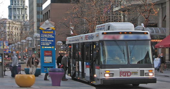 Inspired by Portland’s Equity Atlas, Mile High Connects, a collaborative of nonprofit and philanthropic organizations in the Denver metro region, launched the Denver Regional Equity Atlas project in 2011. The Denver metro area initiated a multi-billion dollar transit expansion project, FasTracks, in 2004 that involves building 140 miles of new rail and bus rapid transit lines. In many communities, low-income and minority individuals account for a significant share of total transit ridership. According to a 2007 Center for Transit-Oriented Development report, low-income households in Denver are four times as likely as higher-income households to use transit. The Denver Atlas’ goal is to “ensure that the region’s significant investment in new rail and bus service will provide greater access to opportunity and a higher quality of life for all of the region’s residents, but especially for economically disadvantaged populations who would benefit the most from safe, convenient transit service.”
Released in 2012, the Denver Regional Equity Atlas “visually documents the Metro Denver region’s demographic, educational, employment, health, and housing characteristics in relation to transit, with the goal of identifying areas of opportunity as well as challenges to creating and preserving quality communities near transit.” While this static document provides a snapshot of the seven-county Denver metro region based on 2011 data, an interactive web tool launched in February 2014, “can be used by practitioners and community members alike to explore the relationship between these different issue areas and to guide investment decisions, grant making and community outreach.” Denver’s list of indicators can be found here.
Equity mapping tools are helping HUD’s stakeholders and partners better evaluate how land use and zoning within a given jurisdiction or region may be contributing to disparities in access to opportunity, segregation, and racially concentrated areas of poverty. More importantly, these tools are being used to better target resource allocations and identify viable solutions. Although GIS-based mapping is not new, the advent of open source data and more intuitive, user-friendly software resources are bringing powerful tools into the hands of those seeking to promote equity and opportunity in local communities and at the state and regional levels.