Population Density
The original Equity Atlas (2007) documented significant growth in the region’s population between 1990 and 2000. The region grew roughly twice as fast as the nation as a whole over that decade, experiencing a 26.6% increase in its population. The region’s population grew at a slower rate between 2000 and 2010, experiencing a total growth of 15.5%, but this was still higher than the national average during that time period.
Where the region’s growing population lives has important implications for our analysis of regional equity. This map series explores how the region’s population is distributed geographically. It includes two maps. The first depicts the density of residents per acre, and the second depicts the density of employees per acre. Taken together, the two maps show the total density of people likely to spend time in a given location on a daily basis.
Understanding the level of activity in a neighborhood can help to inform planning and investment decisions. The maps also can help us to more effectively analyze the implications of the various Atlas maps showing the distribution of key resources and opportunities across the region. For example, if ten neighborhoods have equally poor access to parks, but one of the neighborhoods has a much higher population density than the others, that information could inform decisions about which neighborhood to prioritize for future park investments.


What the Maps Tell Us: Initial Findings
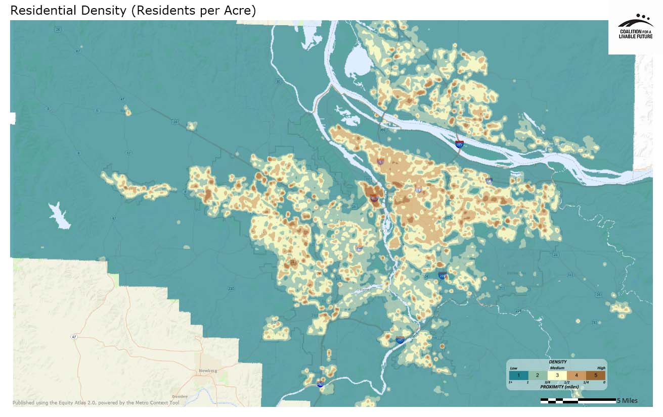
The Residential Density (per acre) map shows pockets of densely-settled areas scattered throughout the urbanized part of the region, reflecting both historic settlement patterns and the influence of more recent land use policies to concentrate development in centers and along transit and transportation corridors. The two largest areas of high density are a cluster of neighborhoods comprised of downtown Portland, the Pearl District, Old Town/Chinatown, the Northwest District and Goose Hollow and a second area in Hillsboro just southeast of East Main Street and SE 10th Avenue. Other high density pockets occur along the MAX line in Rockwood (Gresham), along transportation corridors in Clark County and near Scholls Ferry Road in Beaverton and Tigard.
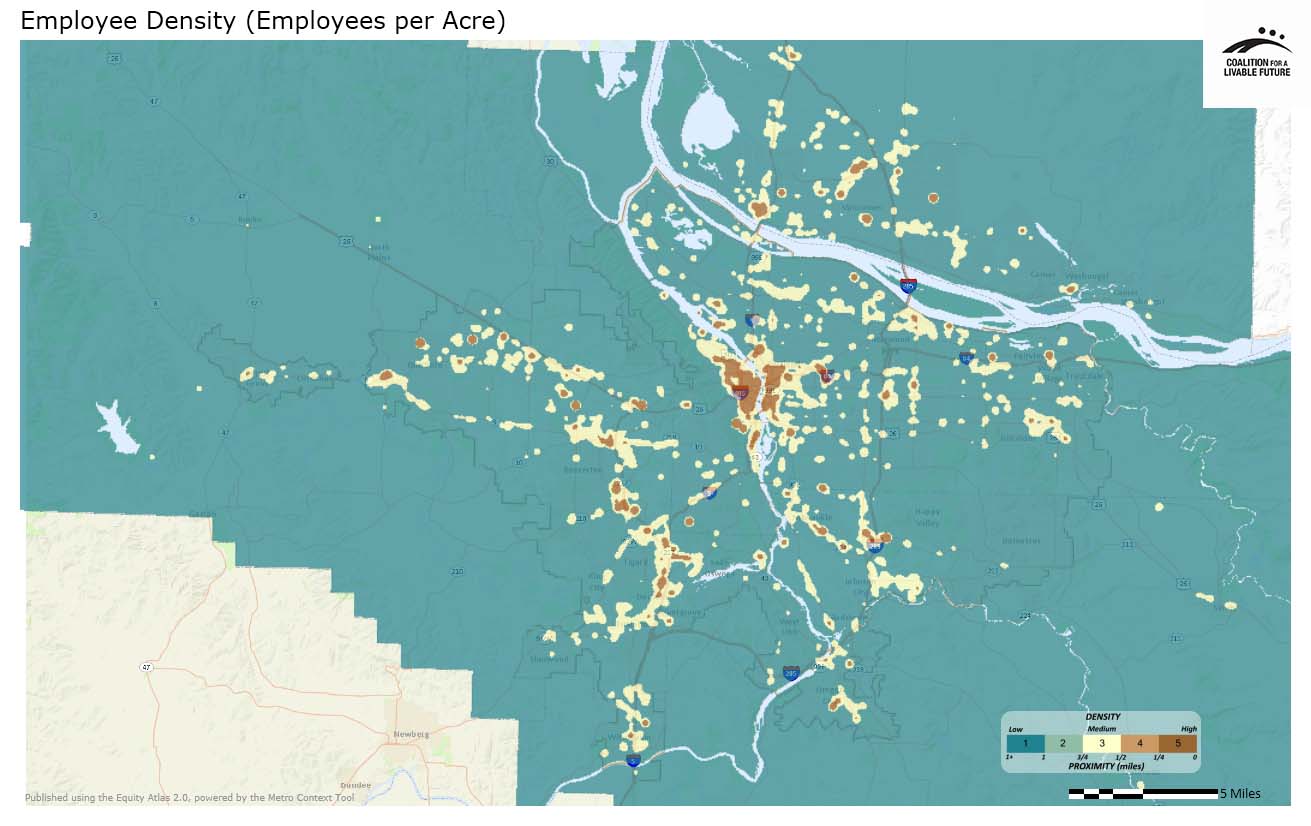
In contrast to the region’s residential density pattern, the Employment Density (per acre) map indicates that employment density is more concentrated, with high density areas located in and around greater downtown Portland and the Lloyd District, along the Interstate corridor and US-26, in nodes along many of the region’s MAX lines, and in a few isolated areas along transportation corridors in all four metro area counties. Because retail and office uses tend to have a higher density of employees per acre than industrial uses, these maps tend to draw attention to retail and office centers, such as the Lloyd District and malls.
While interesting in their own right, these maps can also be used for a variety of other analyses. For example, we could look at the air quality maps in conjunction with these maps to see if people in the region tend to live and/or work in areas of good air quality. Similarly, the maps can be used in conjunction with various Atlas maps showing disparities in access to essential resources and opportunities to identify the areas where targeted investments would have the greatest impact.
About the Maps
Residential Density (per acre)
This map shows density of residents based on data generated by calculating the number of residents per tax lot based on census block averages for differing uses (single-family residential, multi-family residential, etc.). These figures were corrected to adjust to 2010 population numbers and given point values by tax lot. These corrected values were then used to generate a density surface.
Data Source: US Census (2010), Metro Databases (2010)
Employee Density (per acre)
This map shows density of employees as derived from ESRI’s Business Analyst employment data points. The number of employees was used as the point weighting to create a density surface. Most were geocoded to parcels, although some were coded to street centerlines and a few post office box addresses were coded as zip code points.
Data Source: ESRI Business Analyst (2010), US Census (2010), Metro Databases (2010)
|
This document was downloaded from the Map Series library of the Coalition for a Livable Future’s Regional Equity Atlas 2.0 website. The Regional Equity Atlas is a research and education project to promote widespread opportunity for a stronger, healthier, and more sustainable Portland-Vancouver metropolitan region. For more information, visit www.equityatlas.org. |
