Gentrification and Displacement
The original Atlas, published in 2007, documented a dramatic shift in the distribution of populations of color and low-income residents across the Portland metro region from 1990 to 2000, with increasing percentages of these populations moving away from the region’s urban core to suburban and outlying neighborhoods. The Atlas attributed this shift to rising housing costs in the central city that involuntarily forced renters to seek more affordable housing in neighborhoods further away from downtown. In addition, many minority homeowners moved out as housing prices rose and the central city became less diverse. As the Atlas noted, “The social cost of such displacement is high. Living in one neighborhood for extended periods of time facilitates the development of family social networks. Residential stability is key to success in several areas of life, including school performance, job tenure and health ... Residential displacement can take on particularly painful aspects when entire, long-standing communities are disrupted.”
The latest Atlas maps suggest that this pattern of displacement continued throughout the 2000s. This map series examines the region’s population shifts from 2000-2010 and compares those shifts to changes in housing costs. It includes maps showing (a) the percent change in median home value from 2000-2010; (b) the percent change in populations of color from 2000-2010; (c) the percent change in median income from 2000-2010; and (d) the percent change in median home value in relationship to schools with 75% or more of students eligible for free or reduced price lunch, as a proxy for neighborhood poverty.


What the Maps Tell Us: Initial Findings
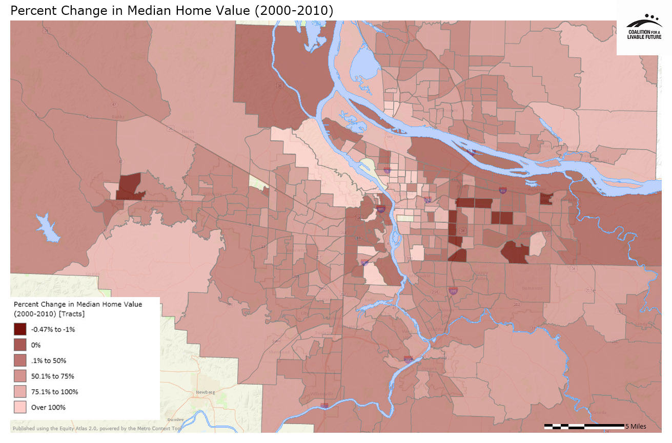
The Percent Change in Median Home Value (2000-2010) map shows that close-in Portland neighborhoods, the west hills area, and western Clark County saw significant increases in housing values in the last decade. The census tracts where the median housing sales price more than doubled from 2000 to 2010 include the Vancouver neighborhoods of Esther Short, Hough and Arnada and Portland neighborhoods in inner northeast and southeast, the southwest neighborhoods of Markham, Arnold Creek, Marshall Park and Southwest Hills, and the northwest neighborhoods of Forest Park and Linton.
Only a handful of census tracts had lower inflation-adjusted housing values in 2010 than in 2000. These census tracts are located in outer east Portland, Gresham, Wood Village and Fairview on the east and Forest Grove on the west.
These data do not fully capture the volatility of housing prices over the past decade. Prices rose rapidly in the early part of the decade and then dropped toward the latter part of the decade. Prices are now beginning to gradually increase again. The map compares sales price data on homes sold in the year 2000 and 2010, so it reflects two snapshots in time rather than the trends over the course of the entire decade.
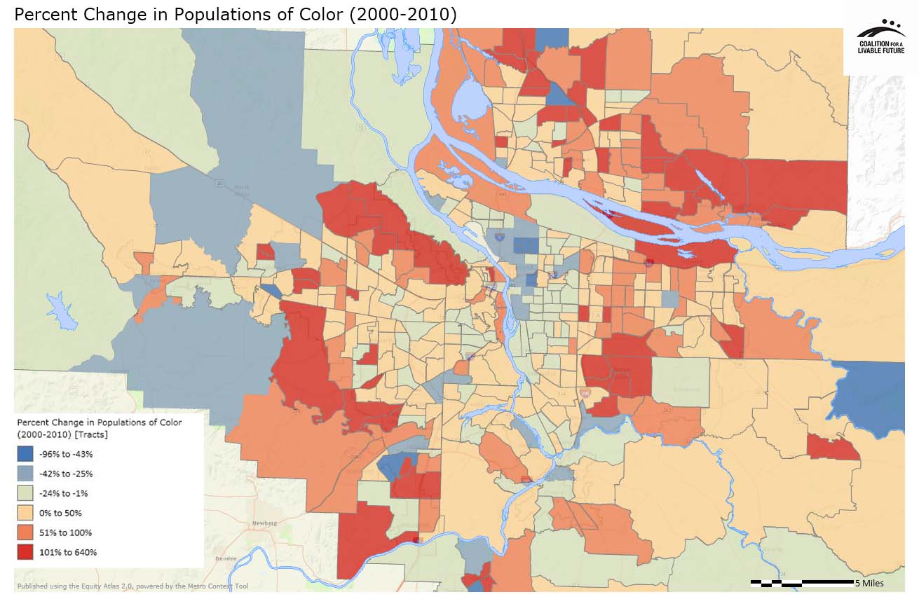
The Percent Change in Populations of Color (2000-2010) map shows how the geographic distribution of populations of color in the region has shifted over the past decade. From 2000 to 2010, the share of the population who were people of color decreased in inner northeast and southeast Portland census tracts, with the largest decreases occurring in inner northeast Portland. Several census tracts in far western unincorporated Washington County and far eastern Clackamas County, beyond the Urban Growth Boundary, also show decreases in the share of populations of color. Increases occurred in inner suburban cities and adjacent Portland neighborhoods and in nearly all of Clark County.
The two maps, when viewed together, show that the census tracts with rising housing values were typically also places where the share of residents who were people of color decreased. (An exception is the Forest Park neighborhood in Portland, where both the share of residents who were people of color and the median housing value more than doubled from 2000 to 2010.) This population shift over the last decade is consistent with the pattern identified in the original Equity Atlas of rising property values and displacement in inner Portland neighborhoods and increasing racial and ethnic diversity in many inner suburban communities.
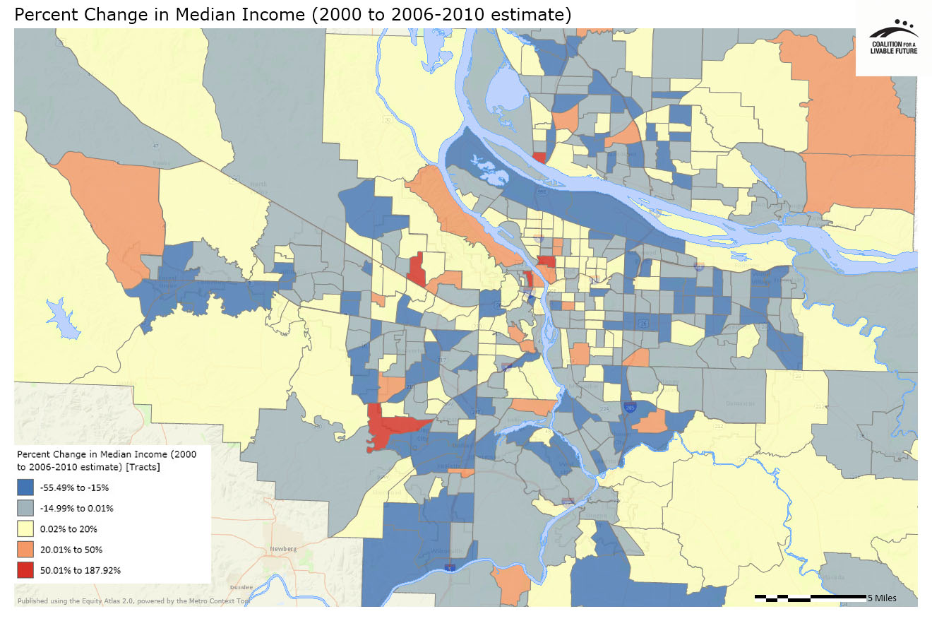
The effects of the recent recession can be seen in the map Percent Change in Median Income (2000 to 2006-2010 estimate). The majority of the census tracts show either modest gains in median income (up to 20%) or decreases (up to -55.49%) during the last decade.
Most Multnomah County census tracts east of I-205 show declining median incomes. In contrast, inner east Portland had more stable median incomes.
In Washington County, median incomes declined in most census tracts in the cities of Beaverton, Hillsboro, Tigard, Cornelius, Banks and North Plains, but a few census tracts in unincorporated areas showed steady or increasing incomes.
Most Clackamas County census tracts show decreasing incomes, with the exception of three census tracts that show median income levels that increased 20% to 50%. These census tracts include areas in unincorporated Clackamas County south of Happy Valley, northeast Lake Oswego, and north of Canby.
Most Clark County census tracts show steady or decreasing incomes. Four census tracts, located in the Ogden/Oakbrook, West Minnehaha, Fairgrounds and Washougal River/Proebstel neighborhoods, show median incomes that increased 20 to 50%.
In the region, only five census tracts show places where median income increased dramatically, from 50% to nearly 200%. They include the neighborhoods of Cedar Hills/Cedar Mills and Bull Mountain in Washington County, Esther Short in Clark County, and the Pearl District and the northern part of the Eliot neighborhood in Multnomah County.
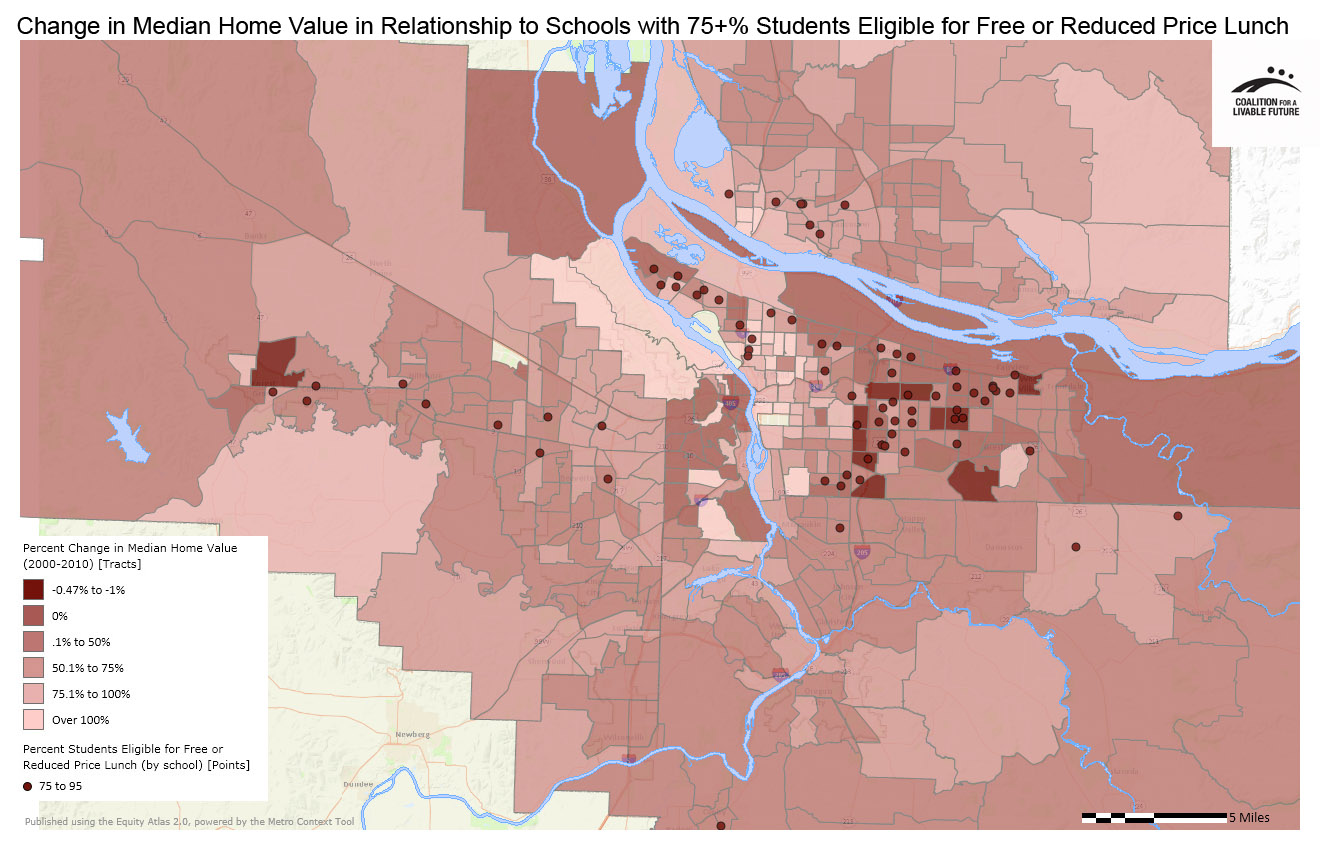
The Percent Change in Median Home Value in Relationship to Schools with 75% or More of Students Eligible for Free or Reduced Price Lunch map explores the relationship between changing median home values over the past decade and current-day school poverty rates (as a proxy for neighborhood poverty). For most of the region, the map does not show any consistent over-arching patterns. The exception is Multnomah County, where there appears to be a fairly consistent alignment between schools with high shares of students who qualify for free or reduced price lunch and census tracts with decreasing or only slightly increasing housing values. It is not clear whether the absence of a similar pattern in the other counties is due to an actual lack of a correlation or because of the inherent weakness of using school poverty data as a proxy for neighborhood poverty.
The first three maps in this series are consistent with the narrative of continued displacement of low-income residents and communities of color from inner Portland neighborhoods and select urban areas in 2000-2010. But, in contrast to the prior decade, these patterns are set against the backdrop of an economic recession that affected most areas of the region. The patterns in the maps suggest the need for continued attention to the dynamics of gentrification and displacement and their effect on equity in the region.
About the Maps
Percent Change in Median Home Value (2000-2010)
This map shows the percent change in median sales prices between 2000 and 2010. The average home values (by census tract) are based on the recorded sales prices of owner-occupied single-family homes on less than 10 acres in 2000 and in 2010. The value is calculated by taking the difference between the average home values in 2010 and 2000 (adjusted for inflation) then dividing the difference by the average 2000 home value.
Data Source: Tax assessor data on homes sold in 2000 and 2010, from Metro RLIS and Clark County GIS.
Percent Change in Population of Color (2000-2010)
This map shows the rate of change between 2000 and 2010 for the population identifying as anything except for “white, non-Hispanic,” based on census data. The rate of change was calculated by subtracting the 2000 populations of color number from the 2010 populations of color number, with the resulting number then being divided by the original 2000 populations of color number to obtain the mapped rates.
The geometries of some census tracts in the greater Portland area changed from 2000 to 2010 (due to tract splits or, in a few cases, merges). The values were also split or merged prior to calculating the change over time based on a value proportion.
Data Source: U.S. Census 2000 and 2010 (QT-P6 Race Alone or in Combination and Hispanic or Latino); Universe = Total Population
Percent Change in Median Income (2000 to 2006-2010 estimate)
This map represents the change in median income for households from 2000 to 2006-2010 for each census tract, ranging from negative change (a decline in the median income) to positive change (a gain in median income). The rate of change was calculated by subtracting the 2000 median income number from the 2006-2010 median income number, with the resulting number then being divided by the original 2000 median income number to obtain the mapped rate.
The geometries of some census tracts in the greater Portland area changed from 2000 to 2010 (due to tract splits or, in a few cases, merges). The values were also split or merged prior to calculating the change over time based on a value proportion.
Data Source: American Community Survey, 2000 (P077 Median Family Income) and 2006-2010 estimate (S1903 Median Income in the Past 12 Months for Households, Families, and Non-Families)
Percent Change in Median Home Value in Relationship to Schools with 75% or More of Students Eligible for Free or Reduced Price Lunch
This map layers the Percent Students Eligible for Free or Reduced Price Lunch by school point layer on top of the Percent Change in Median Home Value map.
Data Source: Oregon Department of Education & Washington Office of the Superintendent of Public Instruction (2011-2012); Tax assessor data on homes sold in 2000 and 2010, from Metro RLIS and Clark County GIS
|
This document was downloaded from the Map Series library of the Coalition for a Livable Future’s Regional Equity Atlas 2.0 website. The Regional Equity Atlas is a research and education project to promote widespread opportunity for a stronger, healthier, and more sustainable Portland-Vancouver metropolitan region. For more information, visit www.equityatlas.org. |
